Precise Charting module - AUTOCAD for Market geometry
General idea
From time to time Timing Solution users ask me about the possibility to add some new charting tools to the software. When I receive these requests, I feel myself very uncomfortable. The abundance of existing charting tools makes this task very complicated for programming. Typically other software developers provide some script machines, so the user should be able to develop his/her own charting tools. I prefer to provide some other technology that makes the procedure of making own charting tools more visually clear.
In this article I will show how to build different charting tools based on geometrical figures. This is not a trading advice, for sure. I simply studied the most common charting figures that TS users have sent me and tried to find some universal methods that allow to cover a maximum amount of cases.
I am not touching here a complicated issue of squaring i.e. creating a properly scaled charts. It is really a different matter, much more complicated from math point of view than simple drawing of some figures. Scaling is discussed separately.
Example #1 - very simple trend line
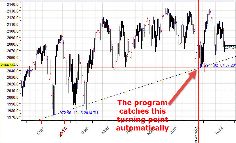
Suppose we need to draw the trend line through these two bottoms: $1972.56 December 16, 2014 and $2044.02 July 7, 2015:
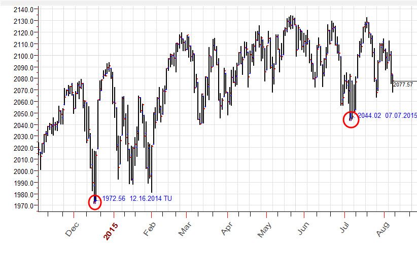
This is really simple to do, just drag the mouse cursor through these two points. The trick here is: while you move the mouse cursor around these turning points, the program automatically catches them (snap mode) and set the exact position for this trend line, it will hit another turning point. The red rectangle around this turning point indicates you that this turning point is snapped, and we can be sure that our trend line hits exactly this bottom ($2044.02 July 7, 2015):
The same manner you can easily draw Gann fans (that connect important bottoms and tops), Fibonacci grids, Andrews pitchfork and many other charting tools.
In this short video you will see how the snapping technology works:
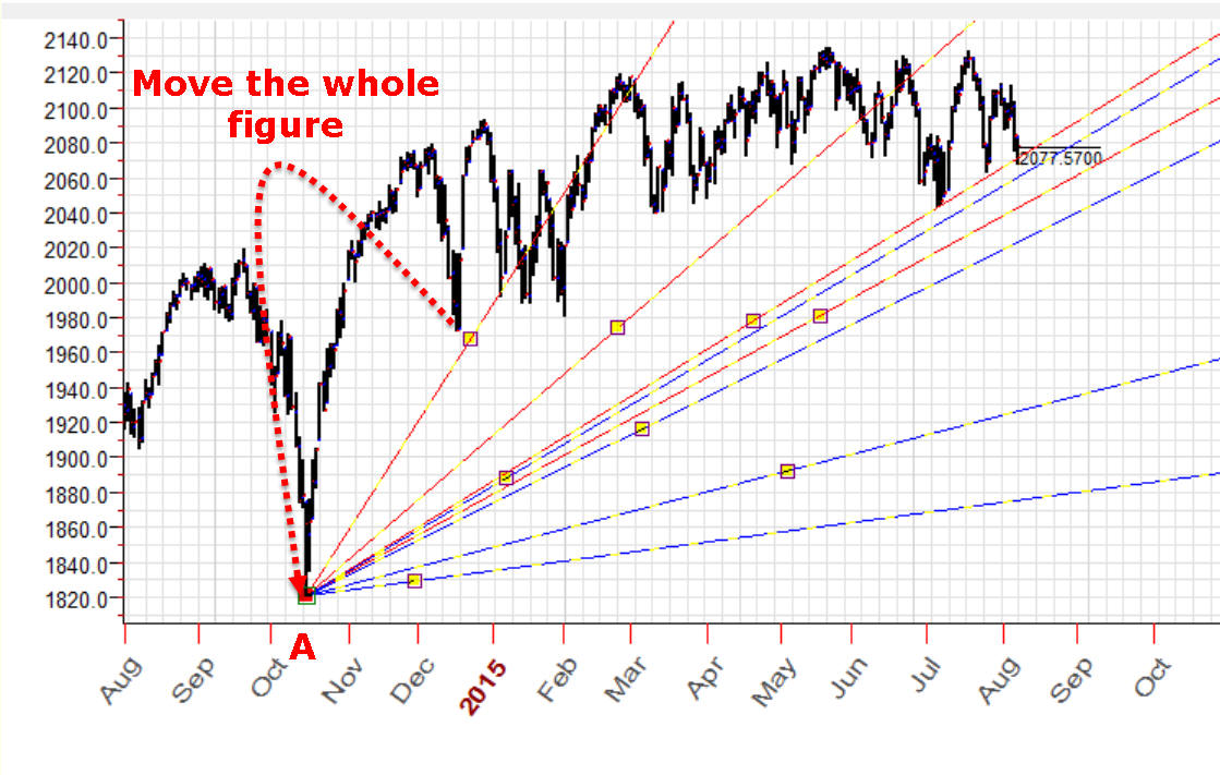
Example #2 - working with group of charting tools
Let's try anaother charting approach. As initial point we will use our bottom turning point A - $1972.56 December 16, 2014. Now we draw the two bunches of trend lines: red trend lines that conncet point A and important tops after December 2014. The same manner we draw the bunch of blue trend lines that connect point A and important bottoms after this date. This is how this chart looks:
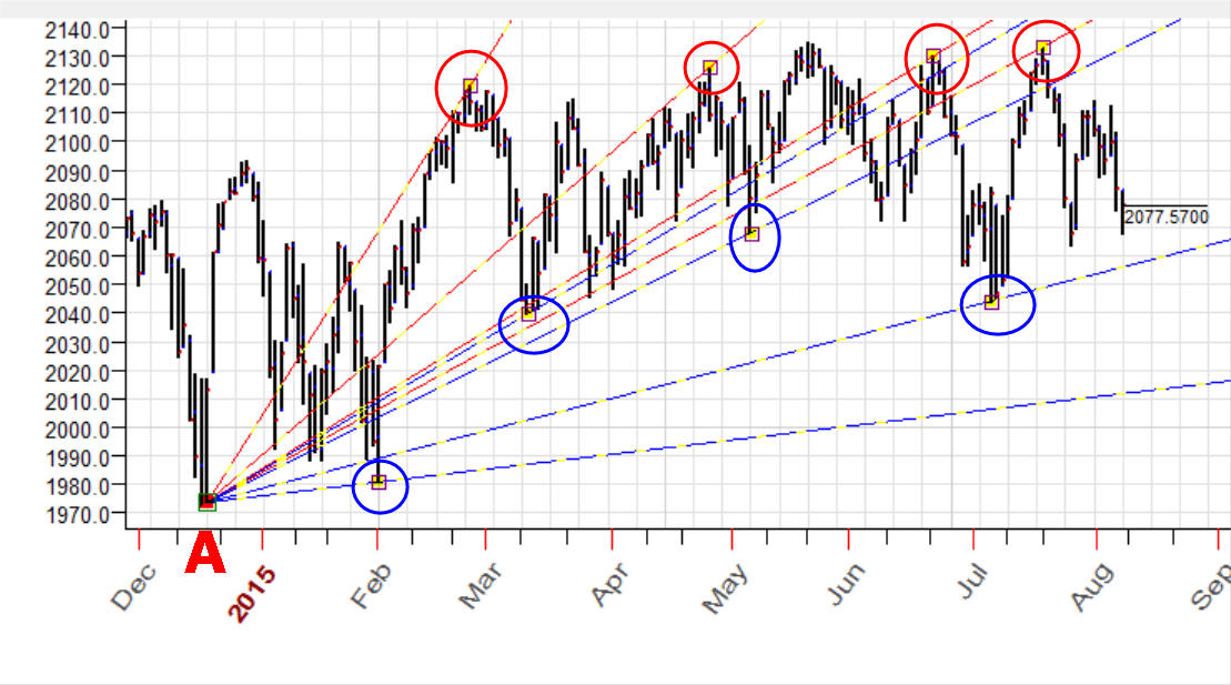
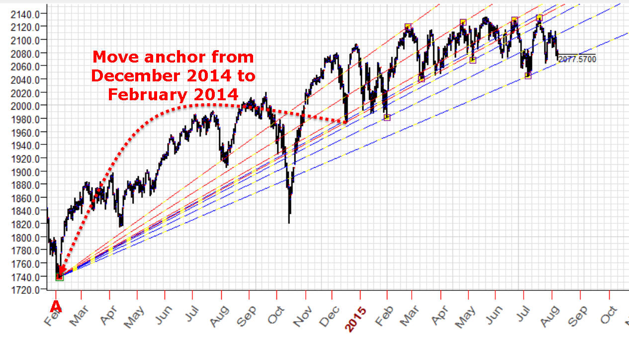
Now we can easly modify our construction. Suppose we decided to use as initial point another turning point - bottom in October 2014, it looks more important. Ok, we can easily drag point A with anchors for all trend lines to this point, all snapping features work the same manner when you drag the several anchors:
Or another variant: we move the whole figure, not modify our trend lines but move them, move the whole figure to another initial point A (to move charing tool/tools you need to press SHIFT key on your keyboard and, keeping Shift key pressed, drag the charting tool/tools):
In this video you will find the explanation how to do that:
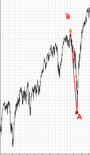
Example #3 - saga about trend lines
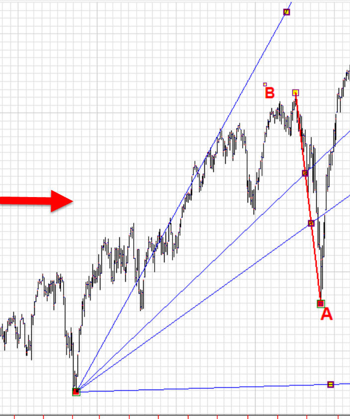
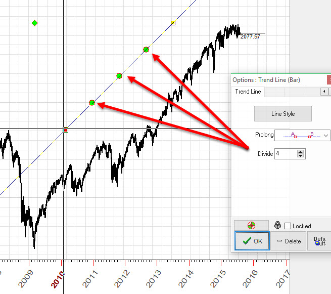
The simplest trend line gives you a lot of possibilities.
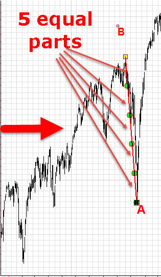
Parts - you can divide your trend line on several (as many as you need) parts and these parts give you new set snap points that can be used in your work. As an example, below I've divided the trend line A-B on five equal parts and built new four trend lines that use these parts:
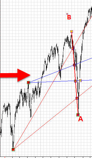
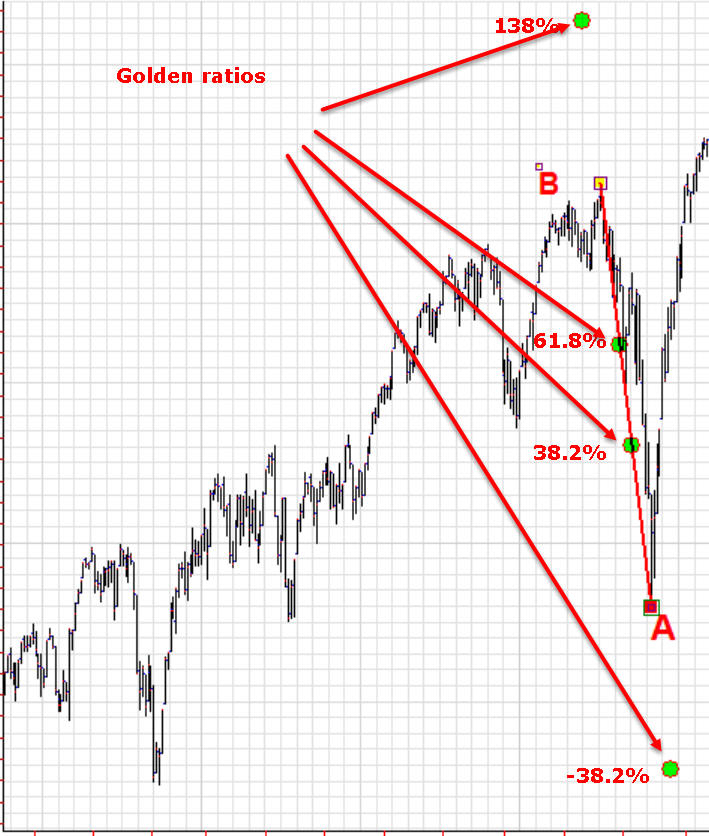
Customized parts - you can divide your trend line using your own ratios. Look at the picture below; there I have divide a trend line using the golden ratios 38.2% and 61.8% as well as 138.2% and -38.% - extended golden ratios. You can see these golden ratio points marked by lime circles; use them as snap points in your charting:
Rays - you can also draw regular geometrical figures using our trnd line A-B as initial point (trend line defines radius and initial angle for our regular figures).
As an example, below I have created seven rays regular figure, all rays have the same radius and are separated by equal angles. As always, we can use these rays (snap points) in our work:
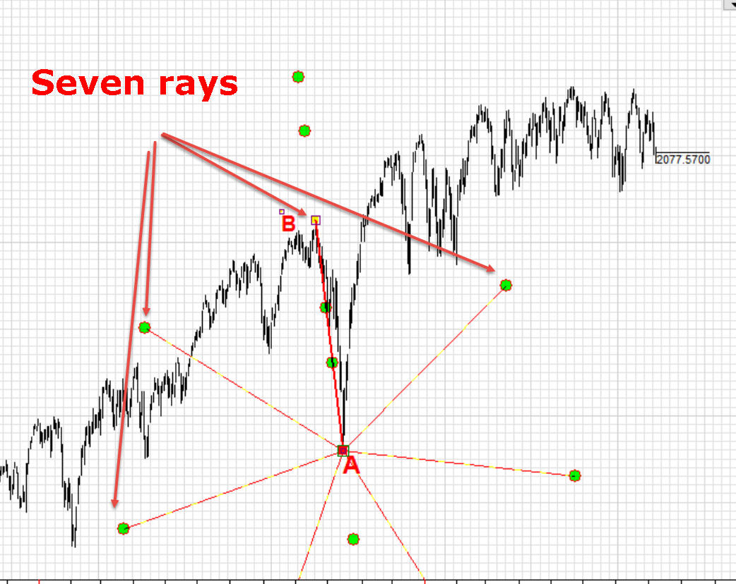
Here you can see how to do that. Also, there is a special class devoted to this subject; you will find more examples there: http://timingsolution.com/TS/Study/charting_tools_saga/trend_line/index.htm
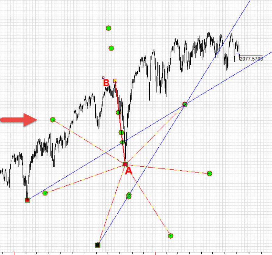
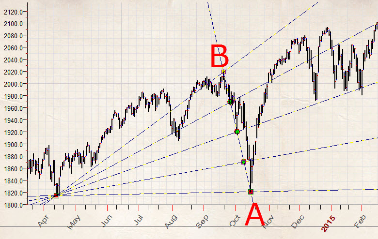
Example #4 - parallel lines
We draw two trend lines, one is for a long term trend A-B and another is for ashort term trend A-C. Divide trend line A-B using golden ratio numbers and 50, i.e. 38.1% 50% 61.8% and 131.8%. After that we draw the lines parallel to A-C, through these golden ratio points:
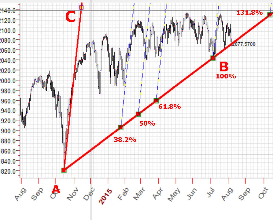
You can do it this way:
Example #5 - customized pitchfork
Example #6
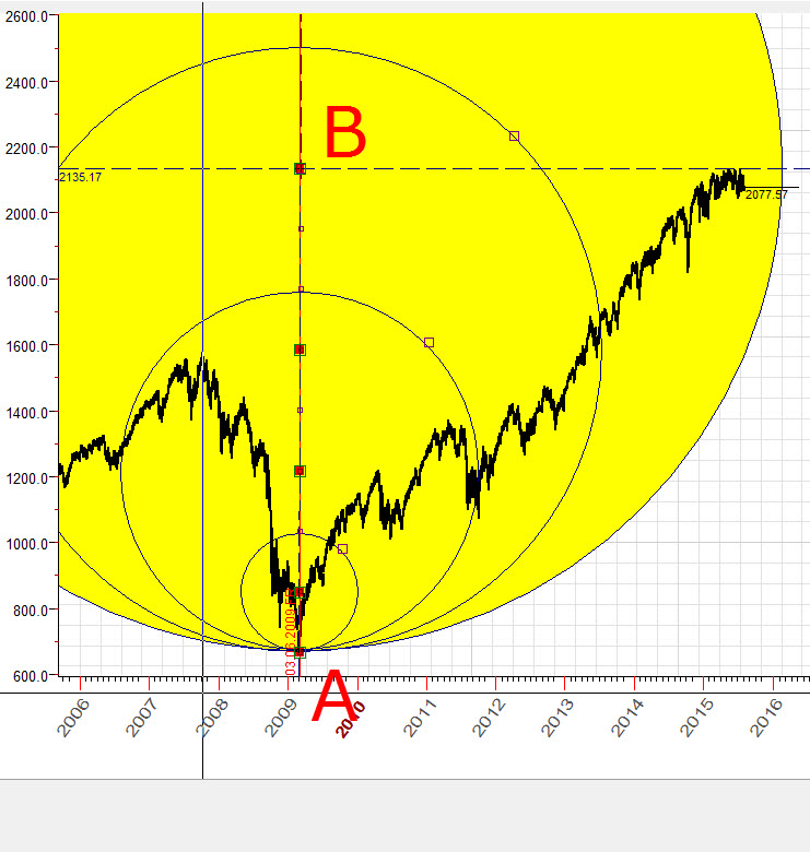
This question was asked by one of Timing Solution users (though for a different price chart). The question is: we draw ideal circle based on three turning points A-B-C. After that we would like to draw a circle with the same radius (as for ABC) through other turning points, D-E. Is it possible to do with Timing Solution?
Yes, it is, and we can do that precisely. The example below shows a circle that goes through turning points A-B-C, with the radius 61 mm; then we draw another 61 mm radius circle through turning points D-E:
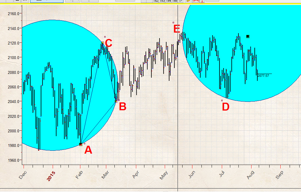
It is a simple task, if you remember your school geometry lessons. So, how to draw the 61 mm circle through points E and D? The right answer is: we draw two 61 mm circles, one with the center in point D and another circle with the center in point E:
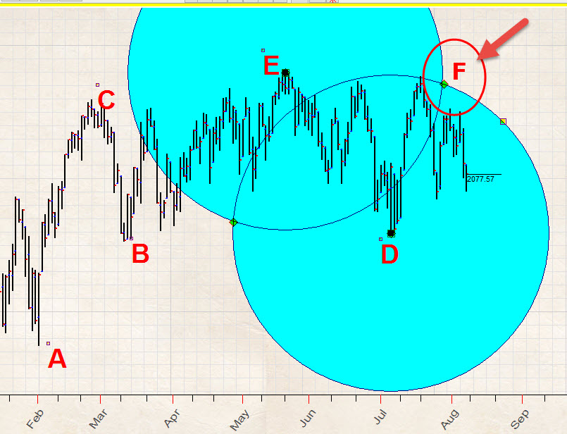
The intersection of these circles, point F, is a center of the circle we are looking for because the both distances F-E and F-D are 61 mm. (Strictly speaking, we have here two intersection points; it means that we can draw two circles. I am more interested with the circle that has centered at point F as it is more about the future than another one that is not shown.) So, we draw the third 61 mm circle with the center in point F, which is the intersection of two circles. The good news is: the program automatically catches the intersection of two circles and automatically sets the center of that third circle to the intersection point.
Look how it works:
Example #7
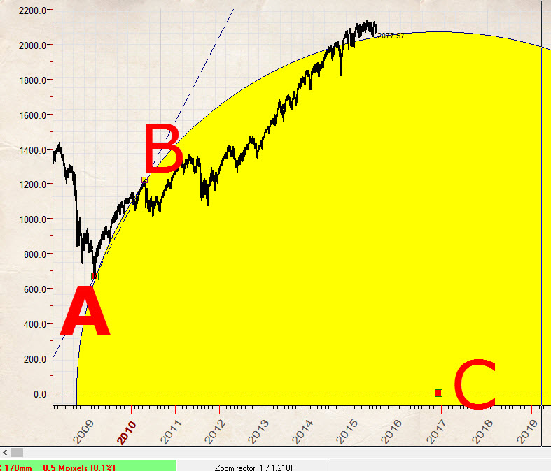
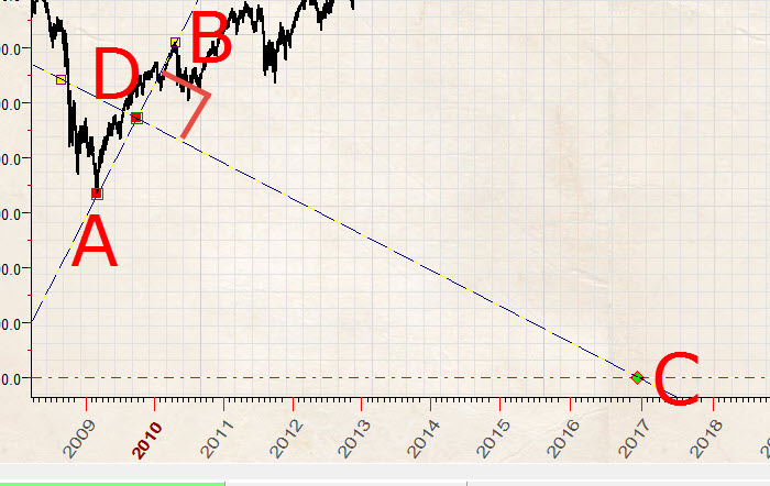
In this example I want to show how to use zero price level, this is one of very frequently asked questions. This technique (zero price level) is used for long term forecast mostly.
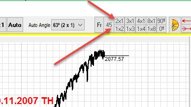
From geometry point of view, it means that we need to draw the ideal circle with the center at zero price and the radius equal to the highest pre crisis point, $1576.09 that has been reached in October 11, 2007. Here it is:
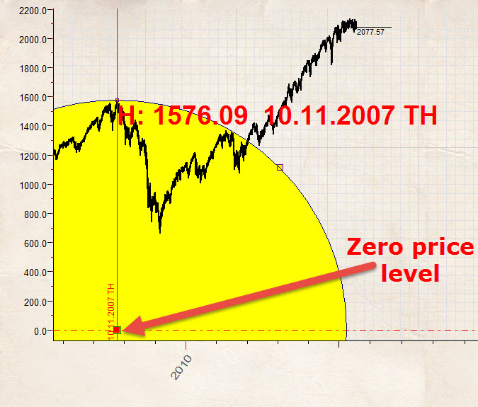
After that through this zero point we draw three angles 45 degrees angle ( 1 price unit = 1 time unit), 54 degrees angle that is based on Fibonacci ratio 1.382 price units= 1 time unit and 63 degrees angle (2 price units = 1 time unit):
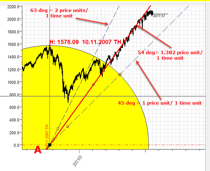
Let's do this together:
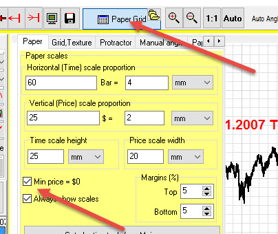
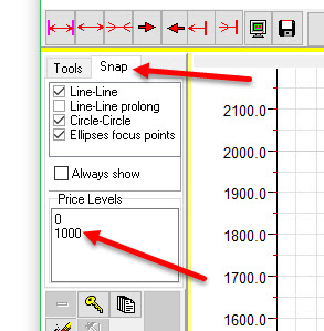
Firstly in paper properties you should define zero bottom margin:
Now apply date charting tool  to catch top $1576.09 at October 11, 2007:
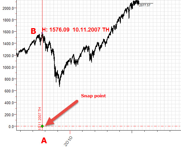
You see, you can use snap point A now; we will draw the circle with the center at this point and also Gann fans.
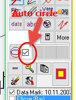
To draw an ideal circle, set ON this option (thus you will be able to get the radius of our circle by dragging the mouse cursor from point A to point B):
Next step is to draw 45 and 63 degrees using auto angle feature:
To draw 54 degrees angle which is based on Fibonacci ratio, choose "Manual" auto angle:
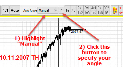
and set the angle proportion in the popup dialog box:
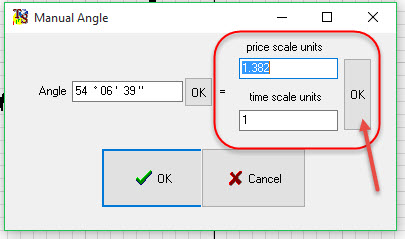
You see, by setting the proportion 1.382 / 1 and clicking "Ok" button, you make the program to calculate the exact angle that corresponds to this proportion: 54 degrees 6 minutes 30 seconds.
Look how you can easily do this job with Timing Solution software:
Example #8
In this example we will draw another 45 degrees angle. The difference is that we will not use zero degrees angle as a initial; instead, we will use $1000 price level. This how it looks:
as initial point A, we use $1000 price level at May 02, 2011 (as an important top):
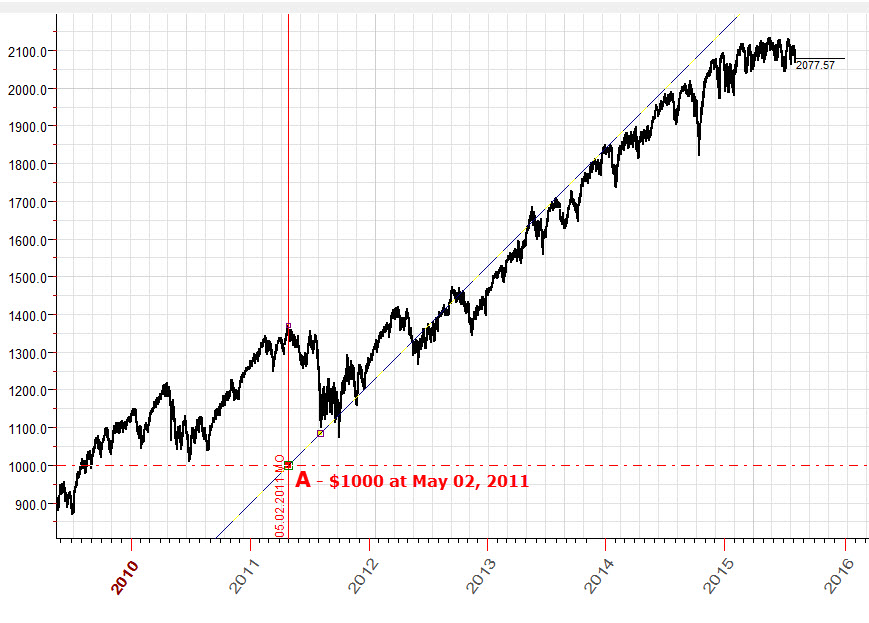
The key issue here is: we define a customized price level ($1000), and program will snap this price level as well:
Here is video explanation how to build this chart:
Example #9
How to draw an ideal circle through turning points A and B with the center at zero price level ?:
Let's solve this geometrical problem. We calculate the midpoint of A-B interval (which is point D) and draw a perpendicular to A-B interval; this is D-C line.
The intersection between this line and zero price level
(point C) is the center of the circle we are looking for:
Now look how you can do it with Timing Solution:
Example #10
How to draw these circles?:
We draw a vertical line (interval A-B) that hits the lowest point of Financial Crisis in March 2009 and the highest point of 2015, divide this interval on 8 equal parts and draw circles with radii equal to 1/8, 1/4, 1/2 and 1 part of A-B interval.
The key feature here is "Parts" parameter of Trend line charting tool. You can set values there that give you all necessary points this way:
In this particular case we divide the line in four equal intervals, and the most important fact is that we can use these intervals as snap points.
For example, we can easily draw the Gann fan that divides interval A-B on four equal intervals:
Look how to draw the circles from Example #9:
Example #11
How to draw ideal square like this?:
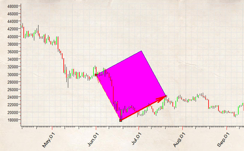
Firstly we draw trend line A-B that corresponds one side of our ideal square. After we make 90 degrees ray:

These points A-B-C are enough to build ideal square using free rectangle charting tool:
Sergey Tarasov
August 11, 2015
May 2, 2016
Toronto, Canada