Cyclical Genome (CG)
written by Sergey Tarassov
Definitions: High probability cycles and Cyclical Genome (CG).
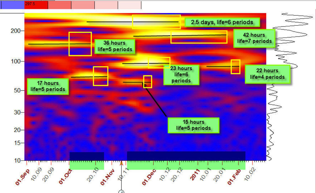
In this article I want to introduce the new concept - High Probability Cycles. We have to be very cautious when introducing this idea because we have to make sure not to mix these cycles with permanent cycles i.e. the cycles that work the same way all the time. For example we CANNOT say that a 57 day cycle will always work for some stock. Research shows that cyclical portrait is always changing. For example today a 65 day cycle will work, but in a few months it will disappear and a new 100 day cycle will start. This is subject of research of wavelet analysis where wavelet diagrams show how cycles appear, live and disappear. It looks like this, it shows how different cycles appear/disappear in intraday data in intraday price chart:
The yellow horizontal stripes above correspond to the cyclical activity. The cyclical life usually covers 3-7 full periods, for example, a 100 day cycle usually lives 300-700 days.
From my understanding the cycles in finance appear as a reaction on fundamental events, this way stock market communicates with the Big World.
I believe at this point the similarity with four human temperaments is acceptable. We know that different people react to life events in different ways, this is the basis of one of the oldest psychological theories that suggests four fundamental personality types: sanguine, choleric, melancholic and phlegmatic.
The question is: can we specify a kind of "stock market temperaments"? Because stock market reacts to world events by cycles we can rephrase this question this way: "Can we specify the cycles where stock market reacts to fundamental events?". Again, we are not talking about permanent cycles i.e. the cycles that work all the time. Different time periods, different cycles are at work. There are a lot of events in our world and stock market reacts to these events with different cycles.
Let's explain the idea of high probability cycle with an example: in stock market behavior you can see a 51, 52, 53, 54 etc days cycle. All these cycles are possible in finance. But 57 days cycle appears more often than other cycles, for some reason his Majesty Stock Market "loves" this cycle more than other cycles. This is not a permanent cycle (that works the same way all the time). This cycle can appear a few times in whole price history and you will not see this cycle in periodogram. But for some reason(s) this cycle has more preference over the 51, 52, 53 etc cycles.
We can take these high probability cycles as kind of behavior pattern that is common for all financial instruments. The research shows that we can specify around 7-8 these cycles (for American stocks). We call this set of high probability cycles CYCLICAL GENOME (CG). The very important fact (this is why I'm writing this article) is: cyclical genome is very stable, it is practically the same since 2002 i.e. the stock market has reacted to external events using the same set of cycles (i.e. cyclical genome) as it has 15 years ago. Definitely cyclical genome is not so stable as four human temperaments (2000+ years) but for shaky financial reality this is good result, very good.
We can define the cyclical genome in mathematical style: it is a minimum set of cycles that maximally describes the price movement of all American stocks (in this article I research American and some Canadian stocks). Or the minimum set of cycles that brings maximum information about stock movement.
How Cyclical Genome is calculated (definition: high probability periodogram)
To calculate cyclical genome we have to apply very special math: we conducted cyclical analysis for more than 1300 American stocks, extracted most powerful cycles and did clustering analysis for most powerful cycles. To reveal these clusters we calculate a histogram, it allows to reveal the zones with high probability cycles, we call it high probability periodogram. High probability periodogram can be used in the same manner as a periodogram in classical cyclical analysis i.e. it allows to reveal the most important cycles. But high probability periodogram allows to conduct cyclical analysis for MANY stocks simultaneusly, not ONE stock only.
In appendix section you will find detailed explanation regarding this algorithm together with the results. To conduct cyclical analysis for more than 1300 stocks with different positions of LBC (Learning Border Cursor) we have developed a special script that took almost a week to execute.
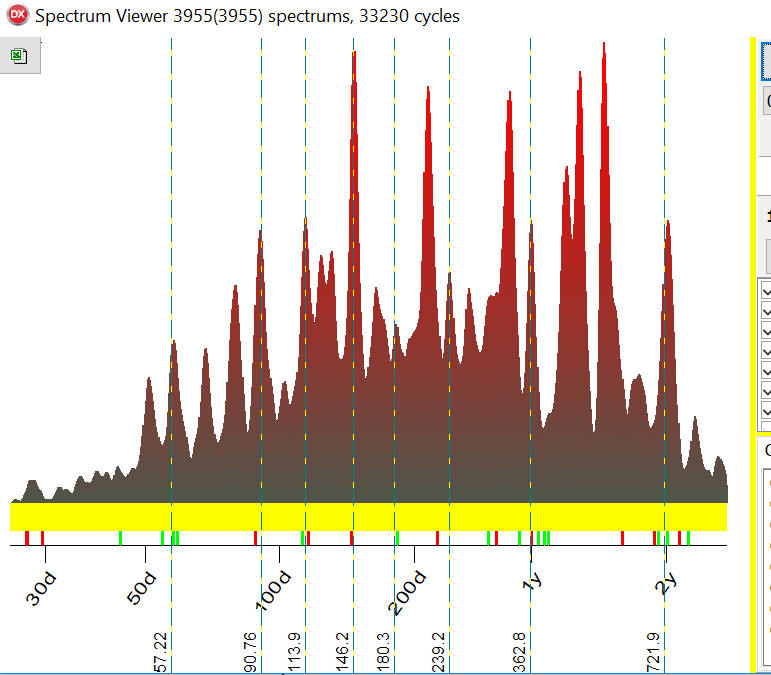
Cyclical Genome
This is a high probability periodogram calculated for more than 1300 American stocks. The green lines show eight of the most powerful cycles found for these stocks i.e. Cyclical Genome for American stocks:
The program calculates Q-Spectrum for each stock, varying LBC three times for each stock. In total there were 3922 Q-Spectrum calculated and 26484 of the most important cycles extracted. The high probability periodogram (histogram) above shows how these cycles are distributed i.e. what cycles are more/less typical. For example, highest peaks here are for a 113.86 days cycle and it indicates that this cycle appears in American stock market charts more often than other cycles.
You see, the peaks on this histogram are very sharp and this is very important result, it means that these cycles are very certain. Initially I've expected to get uncertain, blurry histogram, with no certain peaks. This was surprise for me.
Let's explain this fact using a very simple example. The histogram can be considered as a set of bins, bin for 10, 11 ... 100,101 etc. days cycles . If an 81 days cycle appears in some stock we put a ball into a bin #81. After calculating all cycles for all 1300 stocks we check how many balls are in each bin.
In 110 days cycle bin we have found 10 balls,
111 days cycle bin -12 balls
112 days cycle bin -15 balls
113 days cycle bin - 21 balls
114 days cycle bin - 120 balls
115 days cycle bin - 25 balls
Our conclusion is: 114 days cycle definitely is more active than other cycles. This is good piece of certain knowledge. This knowledge is about existence of some general cyclical pattern if we are considering not one financial instrument but many financial instruments together. This is like behavior of some fishes, they swim together in a coordinated fashion. We can see some logic in this collective movement, it increases the chance to avoid predators. While the movement of one fish can look pretty random. To see the logic we need to see the whole picture.
I have extracted seven of the most powerful cycles (peaks) from histogram above plus I've added Annual cycle (the peak is not high, but I've added it in nonetheless). Here there are eight of the most powerful cycles for American stocks, or cyclical genome:
| Period | The closest astronomical cycle | Notes |
| 113.9 days | Mercury synodic cycle 115.9 days | It looks like this cycle appeared after 2008 |
| 239.2 days | Venus helio 224.7 days | |
| 721.9 days | Mars-Saturn helio 733.8 days | |
| 362.8 days | Annual cycle | |
| 180.3 days | Half Annual cycle | |
| 146.2 days | Mercury-Venus helio cycle 144.6 days | |
| 90.8 days | Mercury helio cycle 88 days | |
| 57.2 days | Half Mercury synodic cycle 57.9 days | This cycle is very unstable, so it should be re examined once in 1-3 years. |
As everything in finance cyclical genome changes in time, some cycles disappear and new cycles appear. Here are high probability histograms calculated for 2017, 2015, 2013, 2011, 2009, 2007 and 2005 years to see how cyclical genome changes in time:
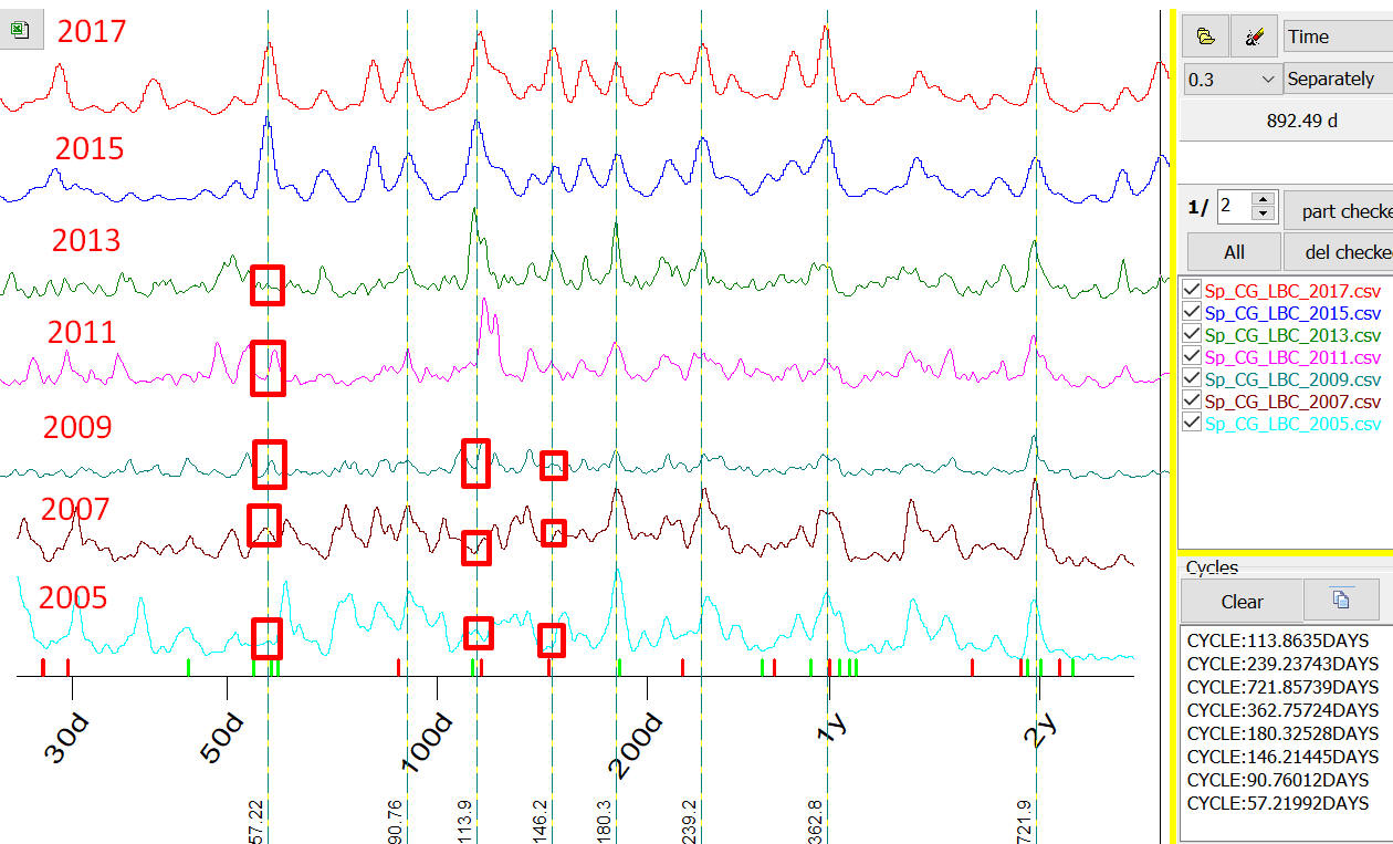
As you see 57 days cycle started to work in 2014-2015. In 2013, 2011,2009,2007 and 2005 years we have no significant peaks around 57 days cycle (marked by red bars). 114 days cycle (or Mercury synodic cycle) and 146 days cycle (or Mercury-Venus helio cycle) started to work since 2009-2010. Actually I remember that I paid attention on some forum to Mercury synodic cycle that started to work in 2008 in the mid of Great Financial Crisis. This cycle did not work before. All other cycles are pretty stable, they work practically in the same manner for 12 years already.
Appendix
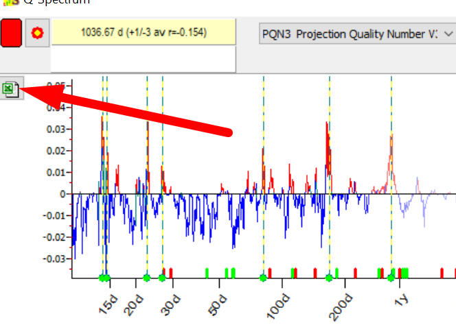
Now it will be explained how these calculations have been performed. In Timing Solution you can calculate and extract the most important cycles using Q-Spectrum or Classical spectrum modules. For example I have used Microsoft (MSFT) and Apple (AAPL). In order to do that I have calculated Q-Spectrum, have extracted the most important cycles and saved this info into Excel file using the button below:
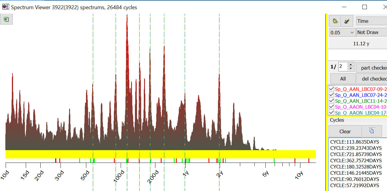
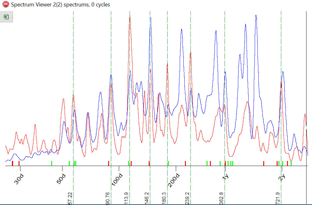
After that I have used a special program "Spectrum Viewer" that can display these spectrums together. Here they are:
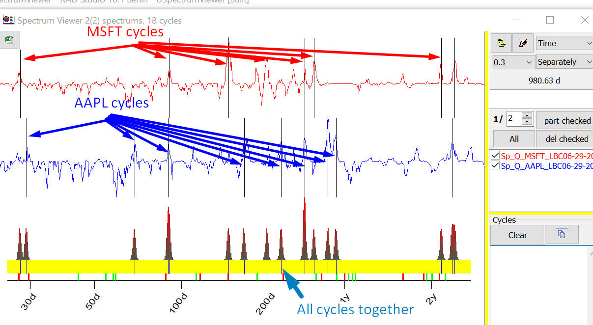
You can see two Q-Spectrum charts for MSFT (red) and AAPL (blue). Vertical lines here correspond the most important cycles for these companies.
Now look at blue panel there, vertical stripes there indicate ALL cycles together i.e. cycles for MSFT and APPL. The cycles for MSFT and AAPL are pretty different, though three cycles are the same: 90, 264 and 870 days cycles.
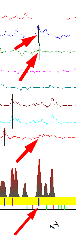
Now let's analyze cycles for eight companies, we have more cycles now and in blue panel with all cycles we can see some clusters now:
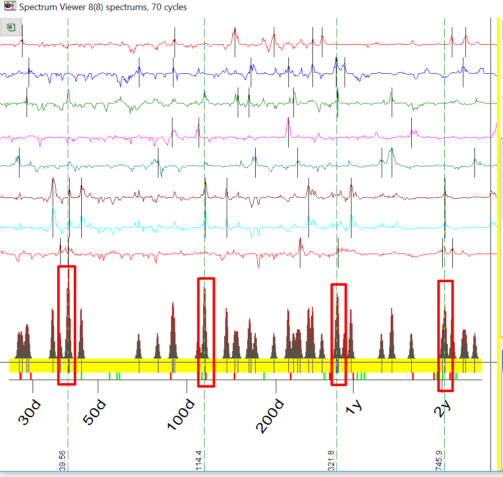
For example we have more stripes around 321 days cycle, this cycle works for 3 stocks:
Going further: I have downloaded Q-Spectrums for 204 stocks, now program analyses 1727 different cycles, you can see clusters now:
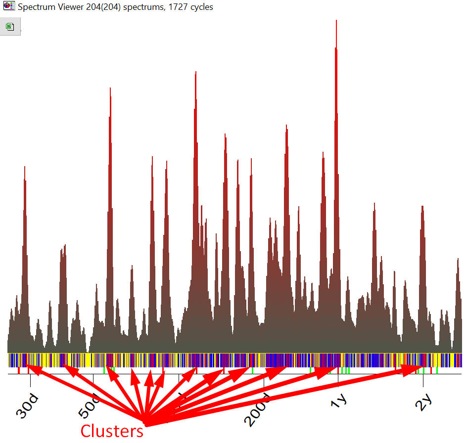
It means that some cycles occur more often than other cycles, clusters indicate to us the most often occurred cycles. To specif.y clusters for 1727 cycles we vary color for vertical stripes in yellow area. Red stripes mean that this cycle appeared 3 times and more.
Also pay attention to red histogram, it shows us these clusters, the higher the histogram the more often this cycle appears in stock price chart. At this point we are starting to apply the formal statistical analysis to reveal clusters instead visual analysis.
When we analyze over 1300 stocks and vary LBC (Learning Border Cursor) three times we have more 59000 different cycles, which makes visual cluster analysis simply impossible. We have to use histogram now to see how these cycles are distributed. We call this histogram High Probability Periodogram.
You should understand that here we speak about PROBABILITY not about power/importance of analyzed cycles.
For example High Probability Periodogram shows a peak 146.7 days cycle, here it is:
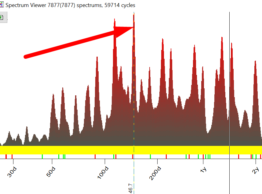
It means that among many other cycles this 146.7 days cycle appears more often than other cycles. Accordingly it means that we have to pay more attention to this cycle, the probability that this cycle will work is higher than probability for other cycles.
How can these cycles can be used in practice? Timing Solution users can display these high probability cycles (cyclical genome) setting ON "CG" option in Q-Spectrum module:
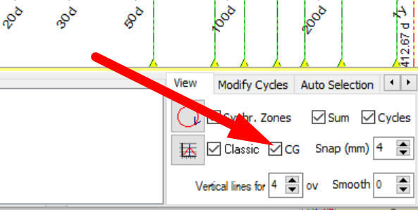
The high probability cycles will be displayed as vertical stripes:
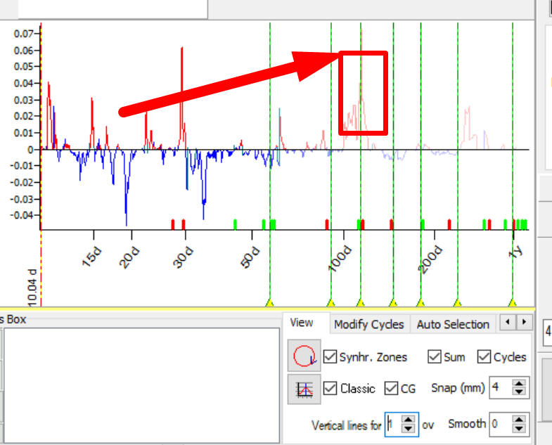
Thus you can see together the most important cycles for any financial instrument (Q-Spectrum chart) and cyclical genome that indicates the most probable cycles for 1300 American stocks.
You see, the 114 Q-Spectrum peak coincides with one of high probability cycles. I believe this is a good confirmation for this cycle.
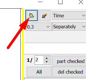
By request, we provide detailed data that is used to calculate high probability cycles. All these calculations have been done with Spectrum Viewer program.
To run this program click "Open" button here:
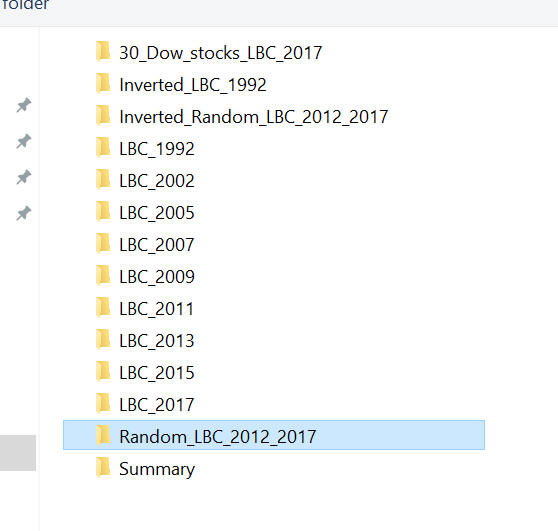
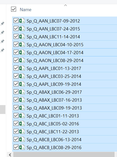
You will find 14 folders there with different data:
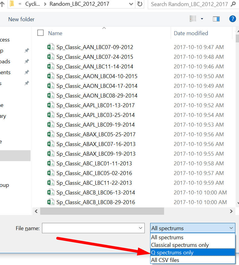
To calculate high probability cycles we used files from /Random_LBC_2012_2017 folder. We have downloaded the price history for more than 1300 American stocks, have calculated Q-Spectrum and Classical spectrum for these stocks and extracted the most important cycles for these stocks. To get a full picture we varied LBC 3 times between 2012 and 2017 years. Thus we calculated the averaged picture for last 5 years. This is a lot of calculations and you will find all the results in this folder.
Ok, let's calculate high probability spectrum for cycles calculated with Q-Spectrum module. After clicking "Open" button, choose Random_LBC_2012_2017 folder and highlight the item Q spectrums only:
Now you should see the data only for Q-Spectrums:
Now highlight any item in this list, like this one:
and make Ctrl-A to highlight ALL files in this list, this is standard Windows procedure:
after calculation you will get high probability periodogram that is used to calculate Cyclical Genome:

You can calculate high probability periodogram for Classical spectrum in the same manner, like this:
You see, Q-Spectrum and Classical spectrum generally reveal the same cycles, the only difference is: classical spectrum emphasizes other cycles:
CYCLE:322.26391DAYS
CYCLE:466.39232DAYS
CYCLE:529.26149DAYS
I personally prefer to trust more Q-Spectrum because it is based on Walk Forward Analysis criteria, this is more about trading while Classical spectrum is more about curve fitting.
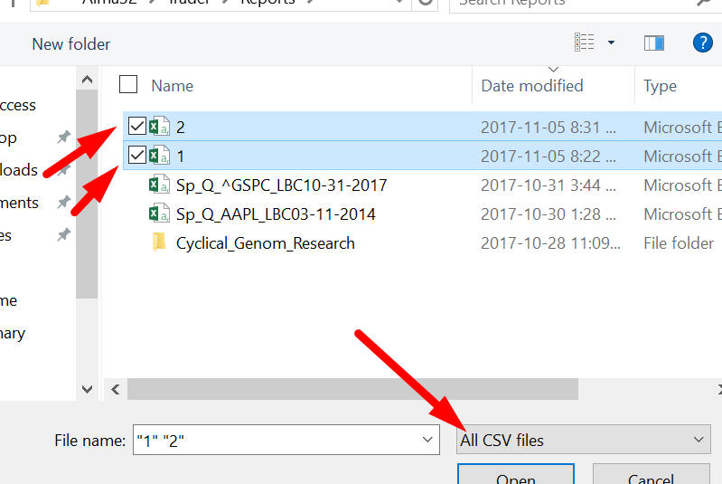
To compare these histograms I recommend to click this button to save high probability spectrum into Excel file:
I have created two files for high probability Q-Spectrum periodogram 1.csv file and and high probability Classical periodogram 2.csv and have downloaded both these periodograms, when you download them don't forget to choose "All CSV files" option:
and highlight "Together" to display these charts together:

Here they are together: red - high probability Q-Spectrum, blue - high probability Classical spectrum:
To understand how cyclical genome changes historically you will find folders /LBC_2017 /LBC_2015 ... etc. Using this data you can calculate cyclical genome calculated for different years.
The important feature of Q-Spectrum module is: it allows to analyze inverted cycles. In Inverted_Random_LBC_2012_2017 folder you will find data with inverted cycles that are active over the last 5 years, since 2012. Below is a high probability periodogram for inverted cycles:
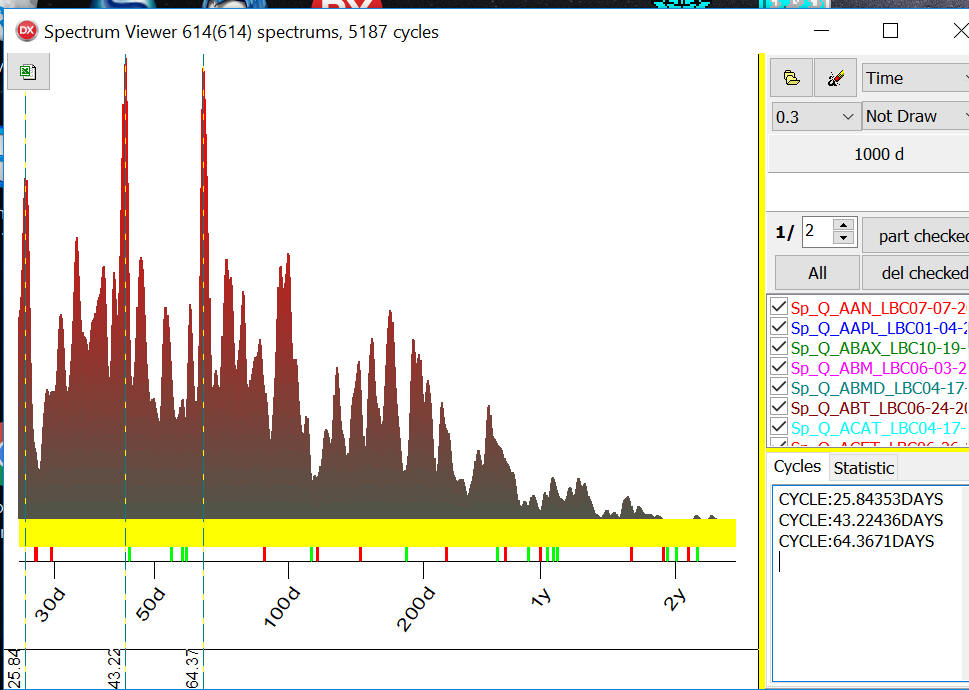
I have selected three high probability inverted cycles 25.84, 43.22 and 64.37 days cycles.
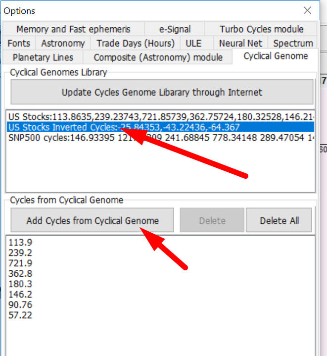
In Timing Solution you can display these inverted cycles in Q-Spectrum module. In order to do that in Options in Cyclical Genome tab highlight "US Stocks Inverted Cycles..." cycles library and click "Add Cycles from Cyclical Genome" button:
In Q-Spectrum module inverted cycles are marked by RED color:
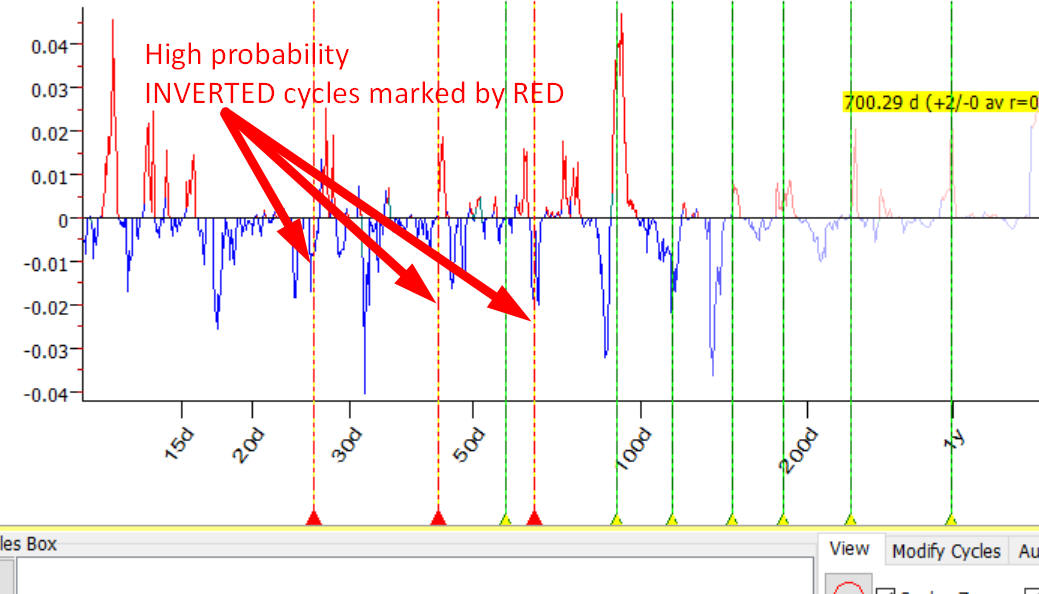
Currently I don't fully understand how inverted cycles work for the stock market. They are a new mathematical entity (as I know). I would prefer to stay away from inverted cycle i.e. consider these cycles as risky ones.
There is one more question asked by Timing Solution users: why cyclical genome shows significantly different cycles than spectrum calculated for indexes.
Below you can see red - high probability periodogram for 1300 American stocks, blue - classical spectrum calculated for DOW (LBC - October 2017):
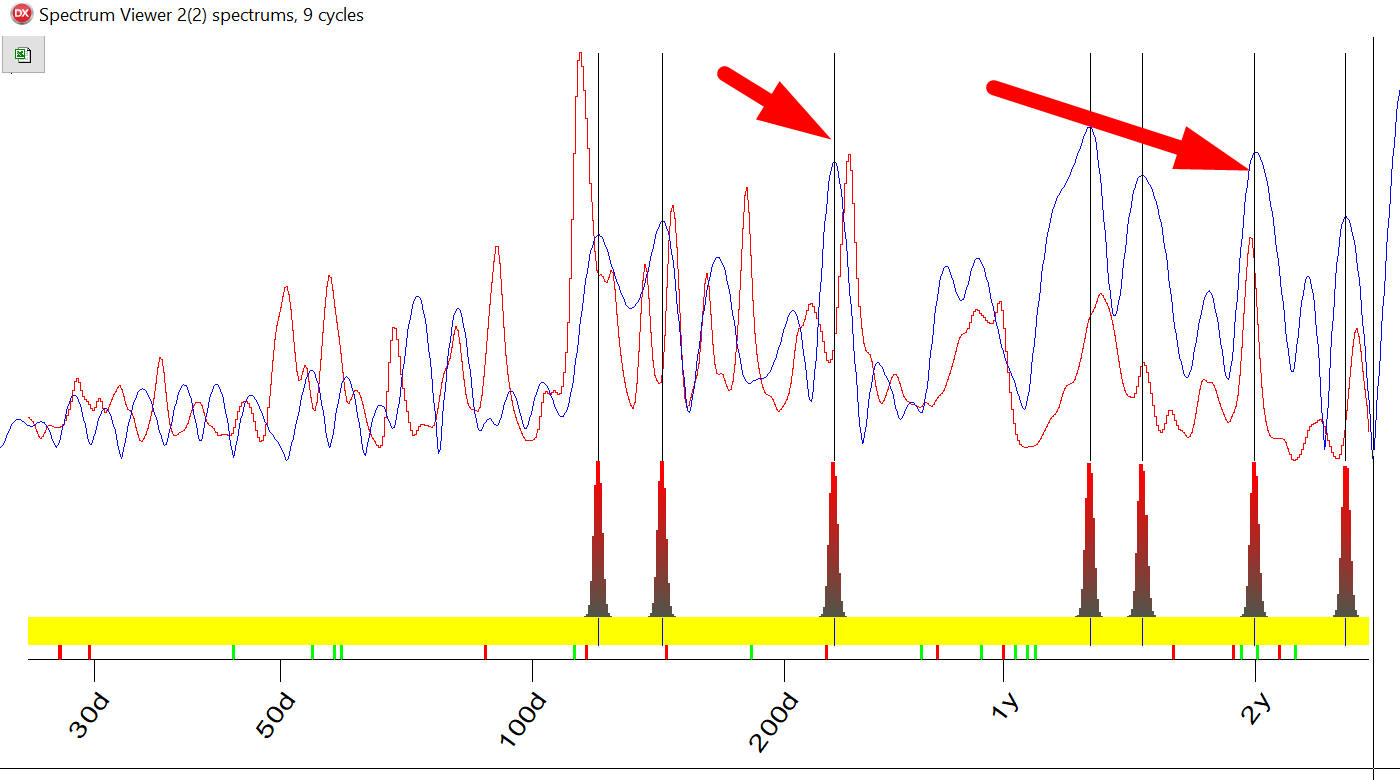
You see, the cycles (i.e. peaks) for both are significantly different, though some cycles are common: two years and 239 days cycle. To understand what is going on there I have calculated high probability periodogram for 30 blue-chip stocks. They are shown in red together with classical spectrum for Dow (blue):
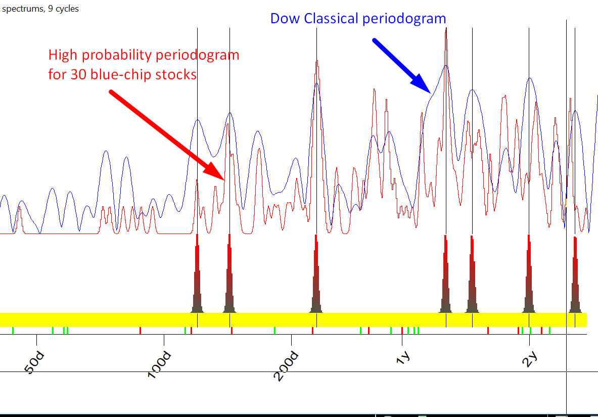
These periodograms show pretty much the same cycles i.e. Dow reflects pretty well the cyclical portrait of blue-chip stocks and does no good for other stocks. I don't have explanation fpr this fact and also "Hypotheses non fingo". Mathematically it means that high capitalized stocks are more correlated than other stocks.
Sergey Tarassov
November 7, 2017
Toronto, Canada