Technical Analysis indicators statistics
This module allows to conduct the simplest statistical analysis for Technical Analysis (TA) indicators in terms of their predictable ability. We do not apply here heavy walk forward analysis keeping this module as simple as it is possible.
Understanding TA indicators histogram
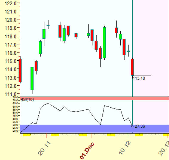
Let's start with some example: the question is - can we expect some uptrend movement after loosing week for Apple computer shares This is the chart:
From the point of view of TA only, we are looking for TA indicators that provide us some information. I've built a short RSI with the period = 10 days and have found that it just hits oversold zone, the latest value is 27.36%. Classical TA tells us that this stock is ready to go up. Now I want to know how we can trust this information.
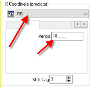
Run TI->Chaos theory module; for analysis. set there RSI indicator with the period of 10 trading days this way:
click "Calculate" button and look what you get:
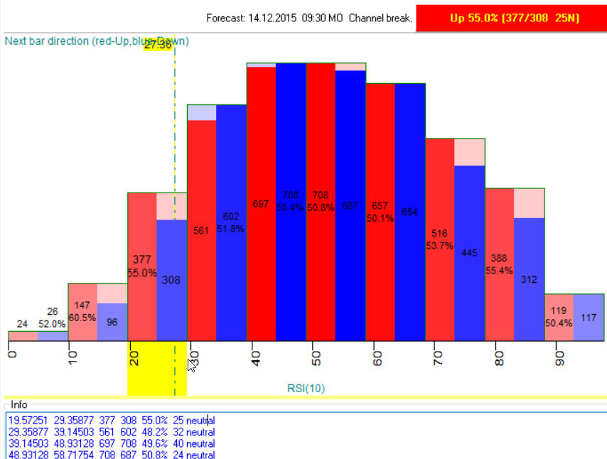
This is a histogram calculated for RSI(10) index, it shows how RSI(10) varies. As you see, most of the time RSI(10) varies in a range of 20%-88%, the highest bars cover this range. In statistics these bars are called "bins".
The latest value of RSI(10) is 27.36%. This value is covered by this bin (19.6%-29.4%):
This bin is marked by yellow bar, and vertical stripe shows the latest value 27.36%.
Now please pay attention: this bin is divided by two bars - red and blue ones. This the most important information in this module, please carefully read what it means.
We have analyzed all moments of Apple price history when RSI(10) falls in this range (19.6%-29.4%). After that we look at the next day and check how many days the price went UP within a day (difference between Close and Open) and how many times it went down.
In our particular case, these red and blue bars tell us: when RSI(10) falls in the range of 19.6%-29.4%, the next day price went UP 377 times (red bar) versus 308 times DOWN. It means that for this value of RSI, with the probability of 55%, we may expect UP movement for the next day.
In other words, the bigger difference between red and blue bars means the more forecast ability of our TA indicator. When the heights of red and blue bars are close in value, it means that we have 50/50 probablity, i.e. we cannot predict the next day with this indicator when its value is in that range.
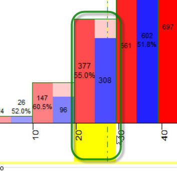
Back to our histogram, you can see that the highest difference between red and blue bars reaches for RSI value 10%-20%:
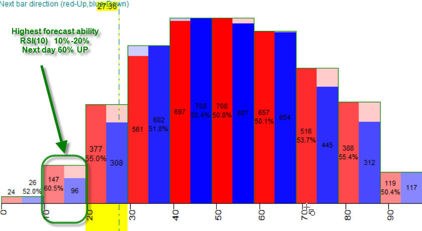
In other words, when RSI(10) falls in 10%-20% diapason we have UP next day movement with the probability 60%.
We can call these zones "windows of inefficiency", i.e. periods when the stock market is predictable (efficient market is unpredictable). In other words, I recommend to keep these zones in mind, zones that are efficient from traders side and inefficient from the stock market side.
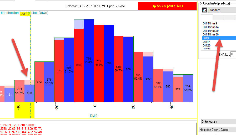
As I see, our goal is to find the TA indicators that give us as many predictable zones as possible. For example, checking all indicators, I have found one more - DMI9 indicator; it provides 55.7% predictable zone:
Coverage option
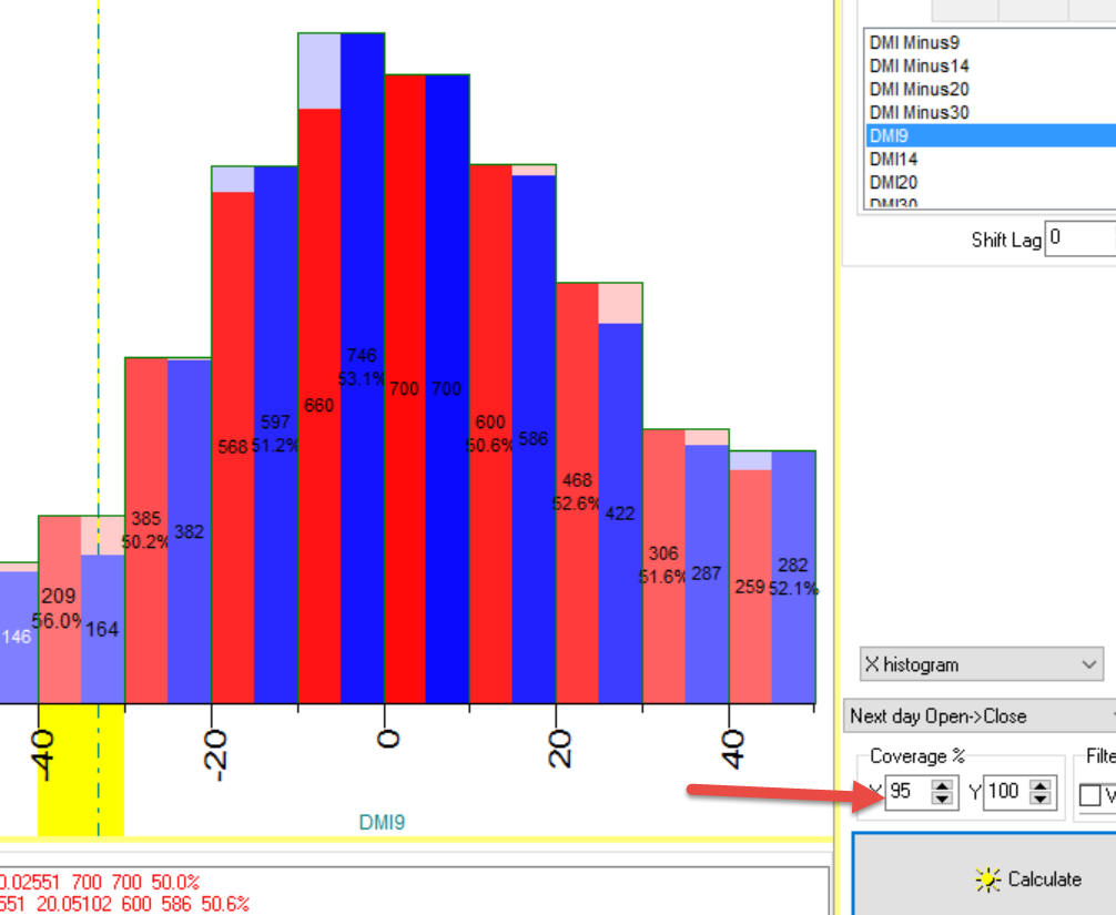
BTW, if your histogram looks like this:
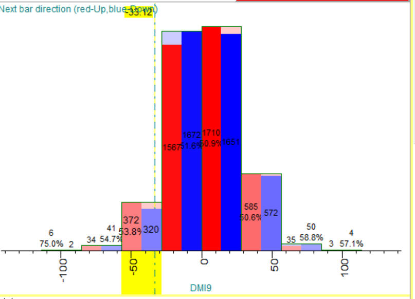
we recommend to decrease coverage parameter, the extreme data will be removed from the histogram:
'
Next day forecast and current day forecast option
There is one more trick here. Suppose we research overnight price change. This is "Open - previous day Close indicator". You can find it here in the list of standard indicators:
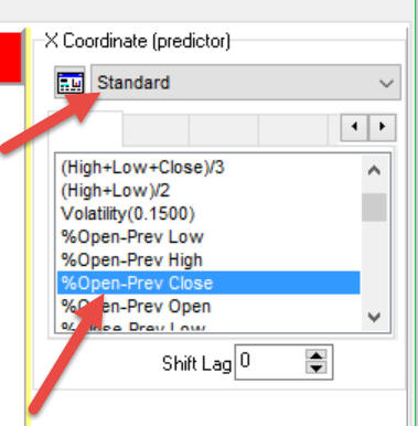
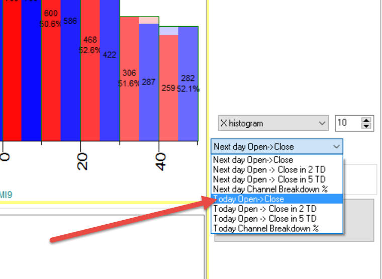
By default the program calculates the effect of this indicator on the NEXT trading day. However, we need to find how this indicator impacts the current trading day. W know the value of this indicator "Open - previous day Close indicator" when the stock market has opened, because we know Open price already. And we need to know how it affects the current trading day, not the next trading day.
In order to calculate a proper histogram, chose this option before calculation:
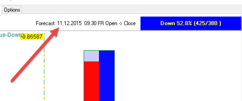
BTW, the program shows a forecasted date here:
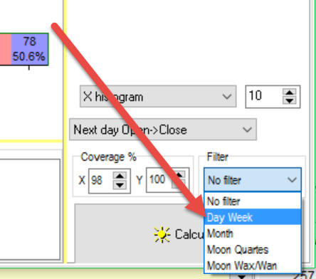
Filters
Filters are one of the most important options. In the first example above we tried to predict Apple price movement for December 14, 2015, this is Monday. To predict this movement we used ALL available price history for Apple (up to December 11, 2015). The question rises here: should we use all available price history or Mondays only? It is possible that Monday technical analysis indicator works a way better; in this case we could ignore all other days of the week, except Mondays. We need to explore this possibility.
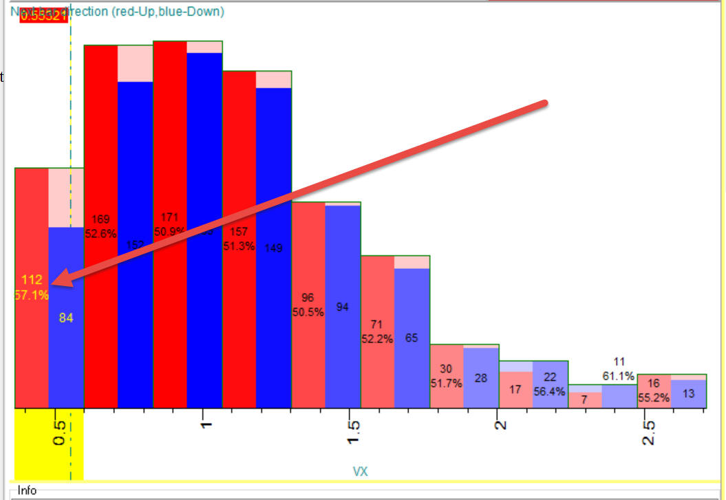
Let me show you how it works. I tried to understand how historical volatility works for Apple stock. This is its histogram:
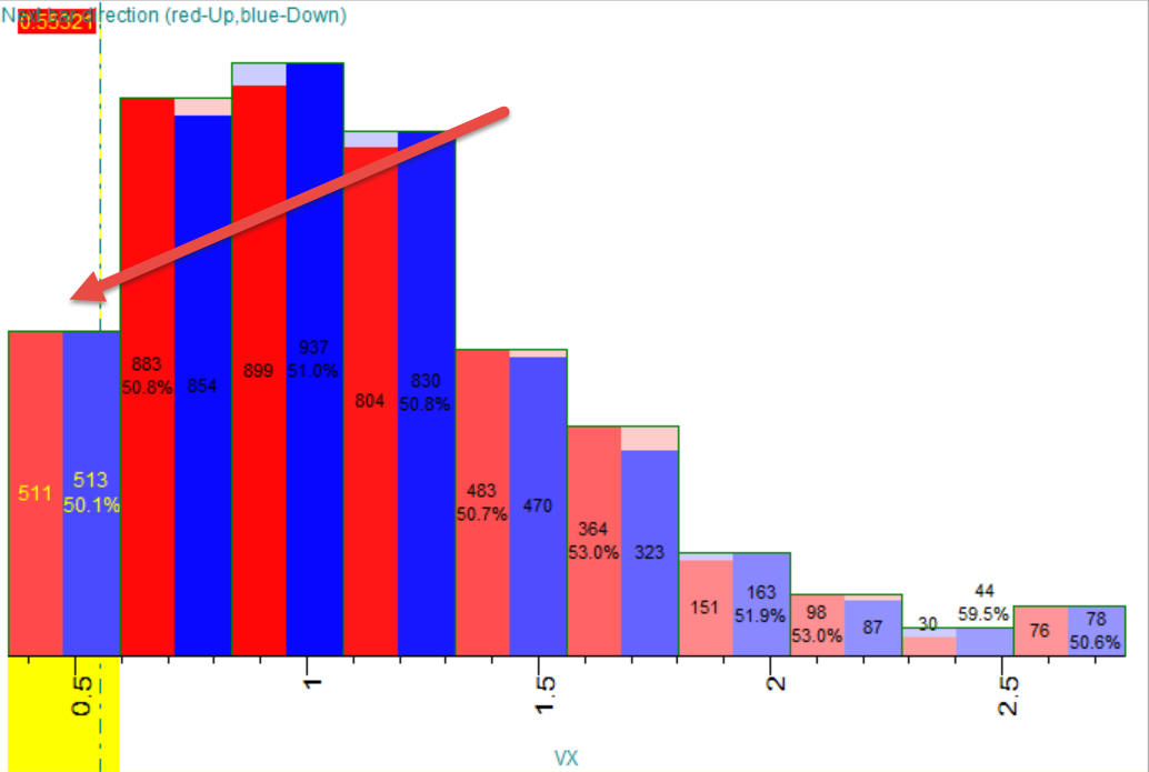
As you see, nothing interesting here 50/50, 511 ups versus 513 dows.
Now lets set filter to "Day of week":
click "Calculate". You will get this histogram that looks better from the
point of view of forecasting ability 57% cases ups:
The same manner you can set a filter for Month (kind of Annual cycle), Moon quarters and Moon waxing/waning.