written by Sergey Tarassov
Fast introduction
Here the new Timing Solution technology will be explained. This technique gives a trader the possibility to draw "right" Gann angles, such as 1 price unit :1 time unit (i.e. 45 digress), 2:1, 1:2, 3:1 etc., in a special way. The core feature here is the optimal scaling that allows to catch turning points with maximum efficiency. In other words, we provide here the solution for the price/time squaring problem. This task can be formulated this way: "how to draw the price chart and what time and price scales to use to get maximum benefit from classical Gann angles and to forecast next turning points the best way?".
Well scaled price chart
This is the most common routine that trader does while working with the charts: drawing different charting figures, like Andrews pitchfork, Gann fans, Fibonacci levels/ellipses; there are lots of them ... My point of interest all the time was (and is) the question: "is it possible to verify these techniques using standard statistical routines and strict mathematical criteria?". The only research in this direction that I have met is the research conducted by MIT in early 2000s. They analyzed different patterns used by technical analysis adepts (like "head and shoulder" pattern). According to their research, such patterns can really forecast future price movements, though the forecast ability of these patterns is around 5% (as I remember).
In this article I want to introduce the new technology that allows to apply statistical routines for finding the best parameters for Gann fans charting tool.
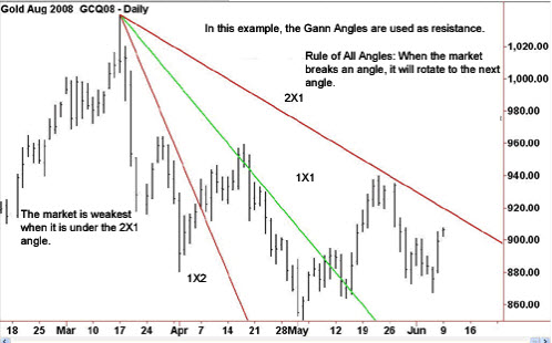
Gann fans is one of the most used techniques in technical analysis. Below its sample is shown (from http://www.investopedia.com/):
W.D.Gann introduced this technique in 1935, in his course "The Basis of My Forecasting Method". He suggested some special angles that divide time and price into proportional parts. As an exampe, the most important 45-degree angle is presented as 1x1 angle; i.e. it represents a price movement of1 price unit per day (trading day). The same way other angles are calculated: 2x1, i.e. two price units per day; 1x2 represents one price unit per 2 days; it could be 3x1, 1x3, and so on.
According to W.D.Gann (as per Wikipedia http://en.wikipedia.org/wiki/Gann_angles):
"Gann watched for important tops and bottoms to form on a daily, weekly, or monthly chart and drew his angles from these changes in trend. When the trend is up and the price stays in the space above an ascending angle without breaking below it, the market is strong; when the trend is down and the price remains below a descending angle without breaking above it, the market is weak. The market shows its relative strength or weakness according to the angle it is above or below. For example, if the price is above the 2x1 the market has shown itself to be much more bullish than if it is above the 1x1. In his angles course, Gann argues that when an uptrending price reverses and breaks under an ascending angle, the tendency of the price is to go to the next nearest angle below it; likewise, when a downtrending price reverses and breaks up through a descending angle, the tendency of the price is to go to the next nearest angle above it."
We should remember that this technique comes from the era when traders did not have computers and had to draw their price charts using some graded paper. Look at the example of soy beans charts 1948-1949:
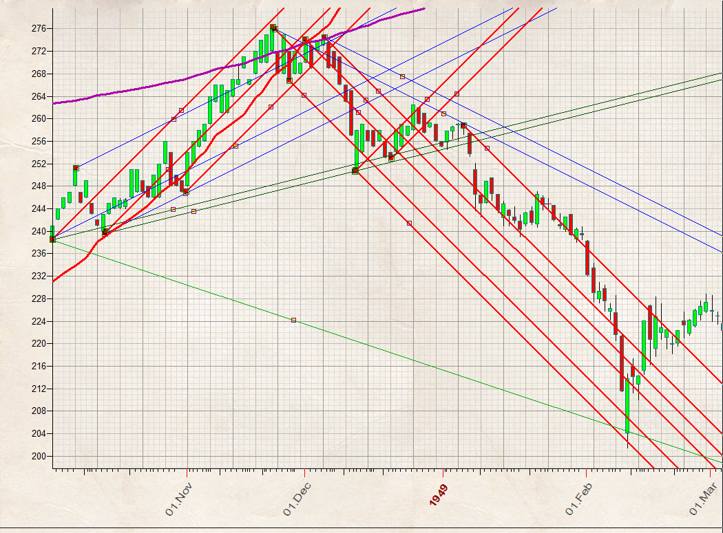
It is a small version (1.5 times smaller) of the soy beans chart drawn on 1/8 inch graded paper (what you see above is the standard output provided by Timing Solution software; original Gann's soy beans chart is here). One inch square here corresponds to 8 price point and 8 trading days. With graded paper, it is very easy to draw 1x1 (45 degrees) angles or 1x2 (26 degrees) or 2x1 (63 degrees) or any other angle. This is very clear and very easy technique, and the graded paper provides us obvious hints. We can name it well scaled chart.
Let us return back, to our third millennium, with fantastically fast computers, instantaneous access to any data you may need, instantaneous information access. Paper price charts look now like some stone age invention. What can they give to a modern mind that is not already revealed by complicated math methods? Nothing, bu exercise in patience and due diligence... I shared these thoughts too, until recent. I recognized that well scaled chart may carry specific information, very clear and very understandable for traders.
Ok, how to scale chart now? Dow Jones Index is now 17000, and if we draw the 1x1 angle as Gann did that for soy beans we get a practically vertical line drawn on huge piece of paper.
From Wikipedia once again:
Gann said that we must devise another scale, in which we postulate that a certain number of points taken together (for example, 100 or 1,000) is to be considered a single price unit in the 1x1 angle, the same as a $100 or $1,000 bill could be considered a single bill. Critics note, however, that Gann did not set down rules for determining how many points should be considered a single unit in such cases and hence that the positioning of the angles on a chart is entirely arbitrary and not scientific; however, there is controversy as to whether Gann completely or partially revealed his methods..
In other words, to apply Gann's ideas correctly, we have to find the proper price scale for our paper.
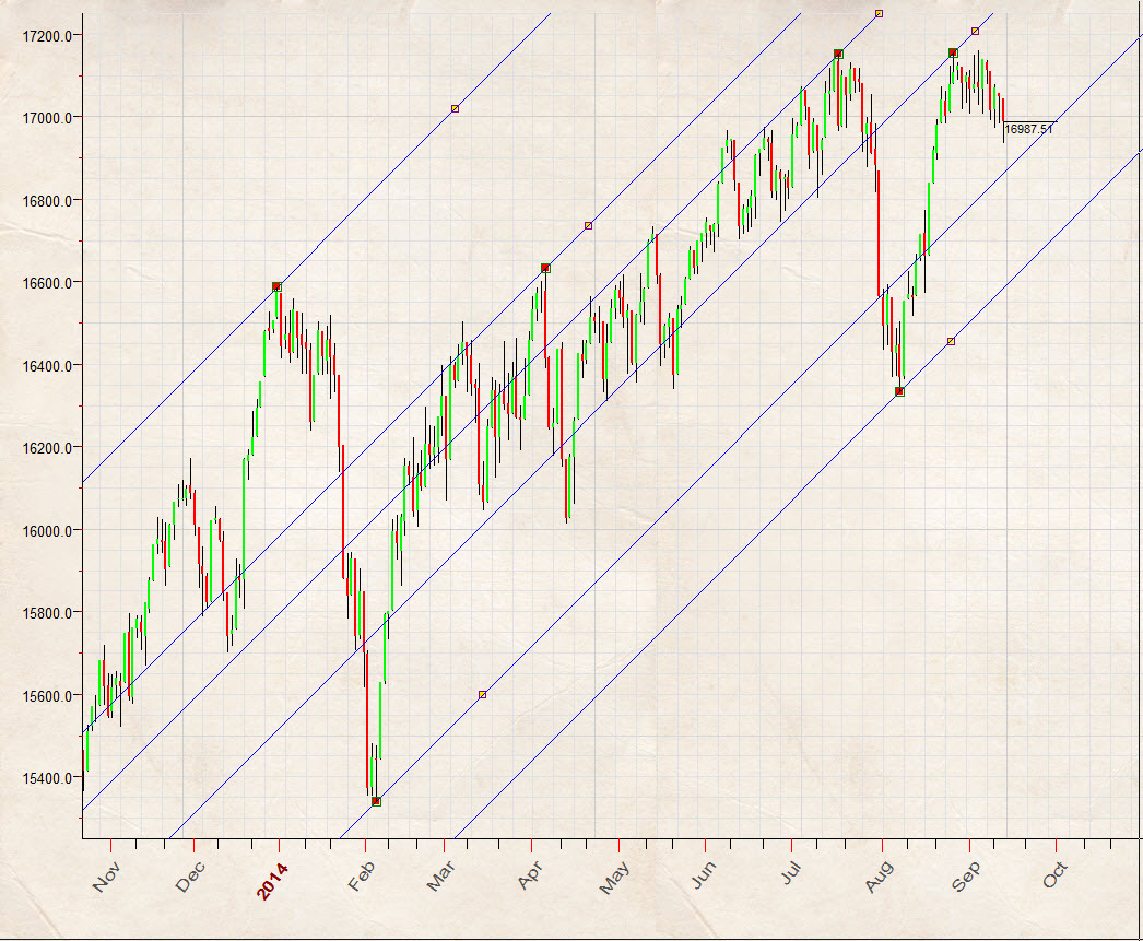
This is DJII chart drawn at 5mm grid paper, 1 mm corresponds to 10 price points (1 cm = 100) and 1mm = 1 trading day:
We can assign other values to our scale, thanks to the power of our computers. And this leads to another question: how to scale our price chart in a better way? This is price/time squaring problem. And we have good news here: it looks like we have found mathematically approved algorithm for price/time squaring problem.
Protractor - profitable angles diagram
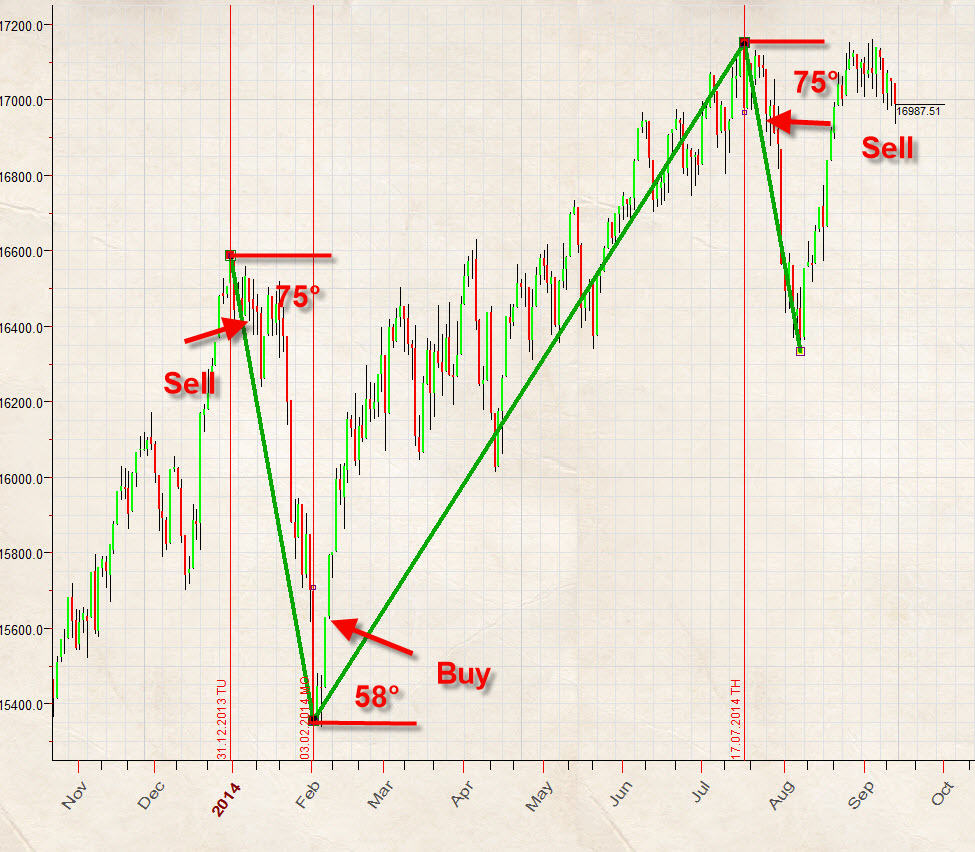
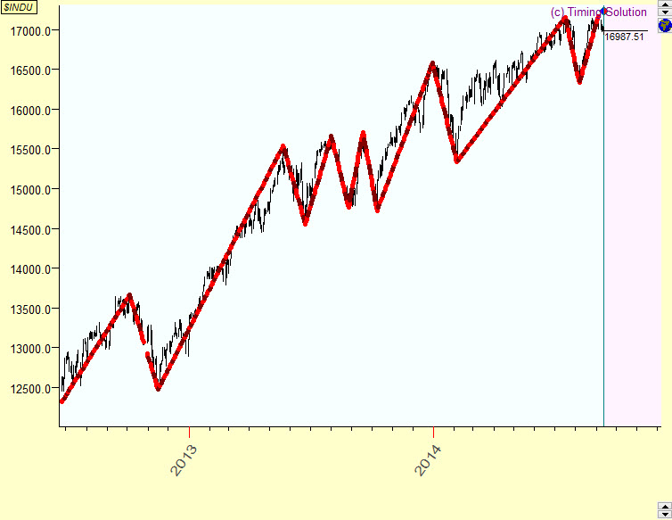
What are we looking for? What does a trader expect from any technical analysis tool? Obviously we would like to have some tool that helps to reveal turning points. For example, leasy trading plan for 2014 can be explained by three digits: 75, 58 and 75 degrees. On the last trading day of 2013, we draw 75 degrees downtrend line, watch when the price hits this line (it happened on February 3) and make a trade when this bottom CIT is confirmed by 300 points up trend movement (which occurred on February 6):
In other words, we need to know the angles that help us to reveal future turning points. There are ways to do that. We can calculate turning points with Arthur Merrill's filtered wave or, simply said, zigzag. This is 5% zigzag for Dow (DJII):
It shows the angles for swings that connect turning points. Our major techniques here is protractor; this is a sample of it for Dow:
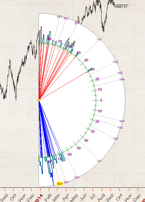
Red angles here represent the angles that show all up trend swings for our zigzag; blue angles are for down trend swings. This diagram helps to reveal the most probable angles for up and down trend swings. We can call protractor as profitable angles diagram.
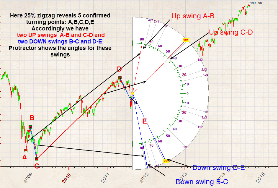
To clarify how protractor works, I have created 25% zigzag for SNP500, since mid of 2008 this zigzag reveals five turning points A,B,C,D and E. Accordingly we can specify two UP swings A-B and C-D and two DOWN swings B-C and D-E. These swings are displayed on the protractor diagram. Pay attention: the protractor shows the exact angles for analyzed swings:
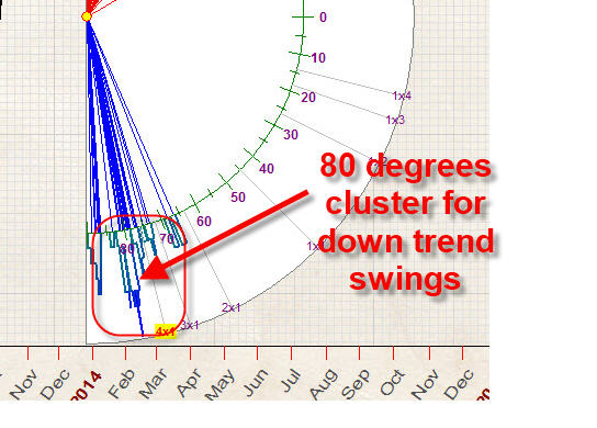
As an example, let say that we see a cluster around 80 degrees for down trend swings, there are lots of blue angles there:
Also you can see the 58 degrees cluster for up trend swings:
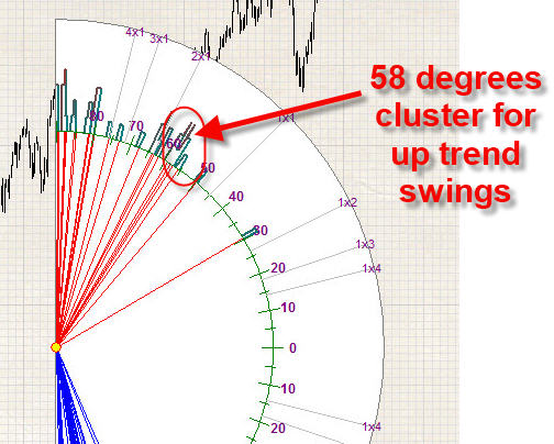
The histogram around these angles helps to reveal these clusters; the higher histogram the more angles are present there. This is important as very often several different swings have exactly the same angle.
As you see there are no 45 degrees angles there (1x1) , neither 26 degrees angles (1x2), nor 63 angles (2:1). In other words, the most popular Gann angles are not suitable for the price chart scaled that way. Instead, we can use 58 degrees up trend angles to catch the top turning points and 80 degrees downtrend angles to catch the bottom turning points; these angles are the most profitable ones for a price chart scaled this way.
Paper rescaling
Now we know that it is possible to find angles that help to reveal turning points. What about Gann angles? It would be good to find the paper scale where classical Gann angles work, i.e. to find the price chart scale where the Gann angles are the most profitable ones.
Here they are, Gann angles, marked on the protractor:
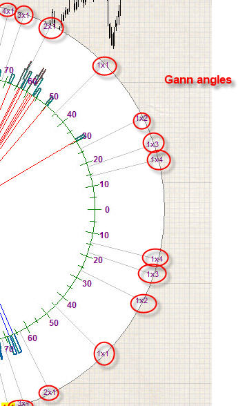
As I understand, this is the core of the price/time squaring problem: finding the price chart scale where classical Gann angles work, i.e. suitable to forecast turning points.
This is the fact that I totally ignored before developing "TS Precise Charting" module for Timing Solution: proper scaling is very important. Proper scaled chart carries some visual information on a paper level while classical Gann angles 45 (1x1), 63 (2x1) etc. may be percepted on an intuitive level. To understand the price chart, we try to employ the idea of geometrical beauty.
"TS Precise Charting" module provides a tool to scale the price chart in a way when classical Gann angles provide the maximum forecast ability. The program very quickly (I would say - fantastically fast) tries differently scaled price charts and looks for the price chart where classical Gann angles work the best way. This is a typical output:
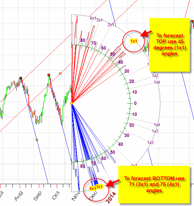
This is a protractor for a properly scaled price chart. It shows a cluster of up trend angles around 45 degrees and other ones, around 71 and 75 degrees, for down trend angles. In other words, these angles are recommended for charting.
I tried to to draw several 45 and 75 Gann angles and got this (just a fast example):
Obviously, to get more certain results, we need at least several months, maybe a year, working together in our Group, finding angles and checking their effectiveness for different markets. I think we should apply some other kind of zigzag, as it is possible that Arthur Merrill's zigzag is not the best solution for this particular case.
In any case, we have developed the technology to scale the price chart in optimal way. As always with technologies suggested by Timing Solution, it will be improved/modified when the new information arrives.
When the right scaling is impossible
The right scaling is possible when there are some clusters in the angles distribution. Sometimes it is impossible to specify any clusters; as an example, look at this protractor for gold:
As you see, the angles there are distributed evenly; i.e. the profitable angle can be located anywhere on the protractor. It makes impossible to forecast them. In statistics, this situation is called "white noise" - any angle has approximately the same chance to be profitable.
So, when analyzing any financial instrument, start with checking the ability to specify clusters, to specify some predictable zones. Cluster is a kind of piece information that you can catch and use for your trading needs.
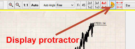
Instruction for Timing Solution users
Everything is very simple. In "TS Precise Charting" module click this button to display a protractor with profitable angles overlaying the price chart:
Here it is:
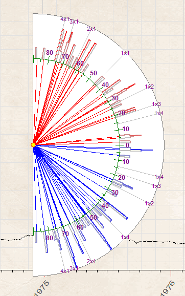
As you see, the majority of profitable angles falls in 80-90 degrees interval, these angles are not suitable for charting.
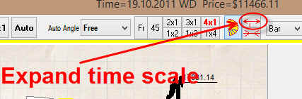
To make this price chart more useful, try to click this button several times; it expands the time scale:
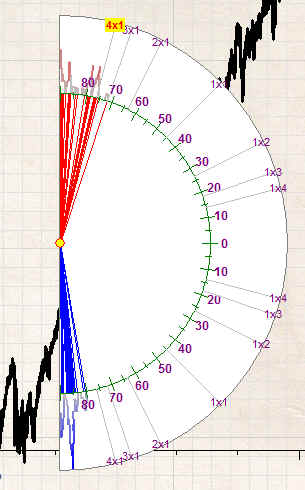
While you expand the time scale by clicking this button, the protractor modifies. This is how it looks now:
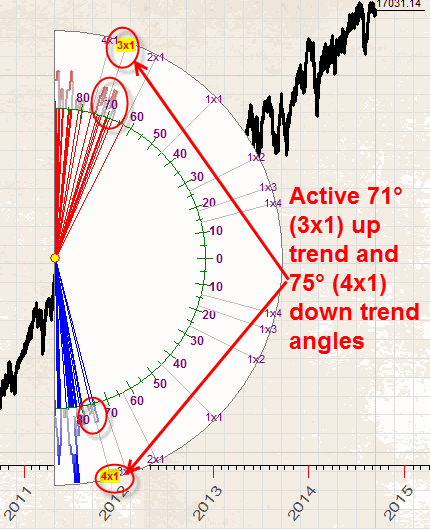
Now you can see active 71 (3x1) up trend and 75 (4x1) down trend angles (these angles are marked by red bold font):
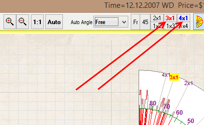
This is a hint for a trader: it is a sign that these angles fit your chart. You can easily draw these angles this way:
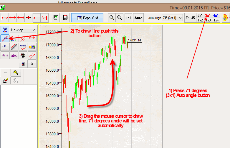
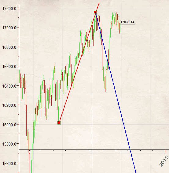
This is how they look on the price chart (just an example):
We recommend to continue to rescale the price chart by expanding the time interval to activate more Gann angles, like here:
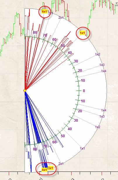
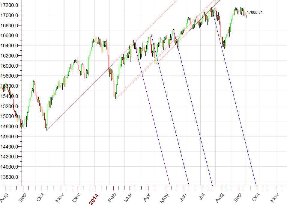
Here these Gann angles are active:
Up trend: 45 degrees (1x1) and 75 degrees (4x1)
Down trend: 71 degrees (3x1) and 75 degrees (4x1)
Now auto angles buttons look this way:
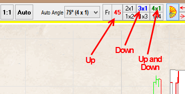
45 degrees up trend - red; 71 (3x1) down trend - blue; 75 degrees (4x1) angle is used both for up and down trend, it is marked by green color. Green color is used when this angle can be used for both trends, up and down.
So, the program emphasizes the most profitable Gann angles and you can use them in your charting.
To rescale the price chart in the opposite direction, i.e. to narrow the time scale, use this button:
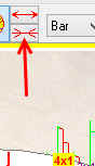
To hide the protractor, simply click this button ![]() once again (you do not need it while you do charting).
once again (you do not need it while you do charting).
Also, if the price chart is too big or too small for charting, you can use zoom in/zoom out/zoom auto buttons:
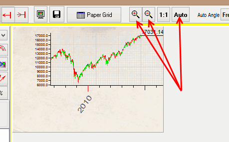
This zooming keeps all price chart proportions unchanged, i.e. all angles will stay unchanged.