Timing Solution Pattern
Recognition
All about the price patterns
Timing Solution Pattern Recognition (PR) is a stand alone program that deals with patterns in financial data. The program contains now the only one though a very effective module: "Similar Periods Finder". We plan to add other modules in the future based on different ideas (like Kohonen Maps and others); this will be done gradually increasing the program's price for new buyers. Thus (as with all TS versions), buying this program, you become a participant of the process. New modules will be added as upgrades, while the updates are coming on a regular basis. You will get the ability to grow with the program, test new methods and apply to your trading only working ideas.
Let us start with the explanation for the first module of this program - Similar Periods Finder.
General Idea: what we can learn from the history
It is better to illustrate the general idea of this module with some simple example.
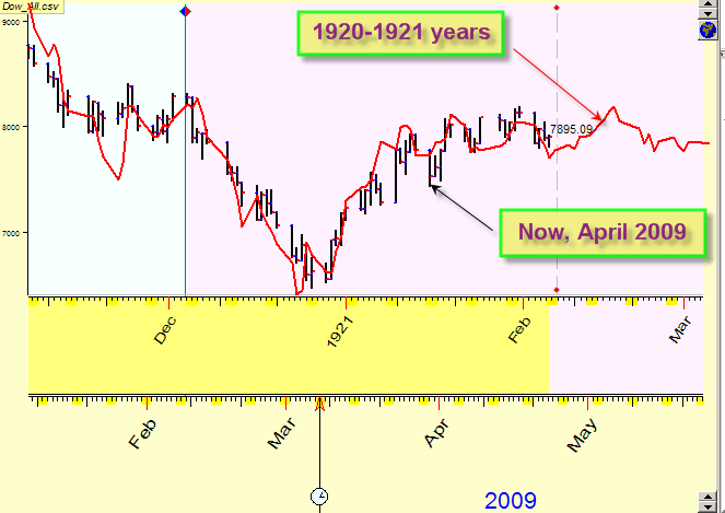
Today is April 23, 2009. I am looking at the price chart trying to anticipate what the current market condition promises in the nearest future. Though we cannot forecast the future 100% accurate, it is possible to find some analogies in the past to get some clues in this regard.
Here I have combined together these two charts:
The black one is a current chart while the red curve is Dow Jones Industrial index price chart for the years 1920-1921.
It does not matter to us that this current moment and 1920s are separated by almost a century. The only thing that matters here is the human component. Its effect on the stock market movements is tremendous. A good news is that the human behavior is the most stable thing in the World. It changes very slowly (remember the books that were written hundreds and even thousands years ago; really good books touch our hearts and minds in the same way as when they have been published). Thus we can assume the existence of patterns in the stock market behavior.
The best thing about this technique is: we know how the price has moved in the past; this fact gives us some clues regarding the future movements.
See another chart; it sends us to the year 1931:
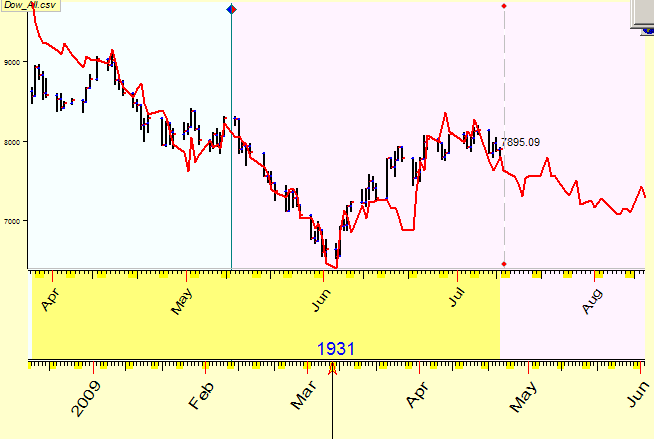
Remember that we deal here with similar periods, not with identical ones. Below you will find a description how to look for them.
Personally, I believe that it is better to analyze these similar charts using some knowledge of the periods involved. The similar period found is not just a some set of data. It has occurred at some specific period of our (and market) history. People lived at that time and did something. If we know what has happened then (like who did what, the sequence of the events, etc.), we can figure out what lesson is given to us by the history of that moment; we may be prepared for the future actions. It is in our plans - to incorporate some historical information to Timing Solution.
Going into depth - inter market analysis
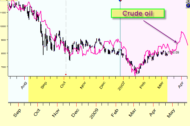
The examples above were related to DJI; we have compared its different periods. The idea can be easily extended: consider different financial instruments. Thus we perform a kind of inter market analysis.
See here the price chart for the current situation (April, 2009) for Dow (a black chart) together with the price chart for crude oil in 2006-2007 (a purple chart):
Or the situation with Dow now is practically the as 10-year Bonds in 2005:
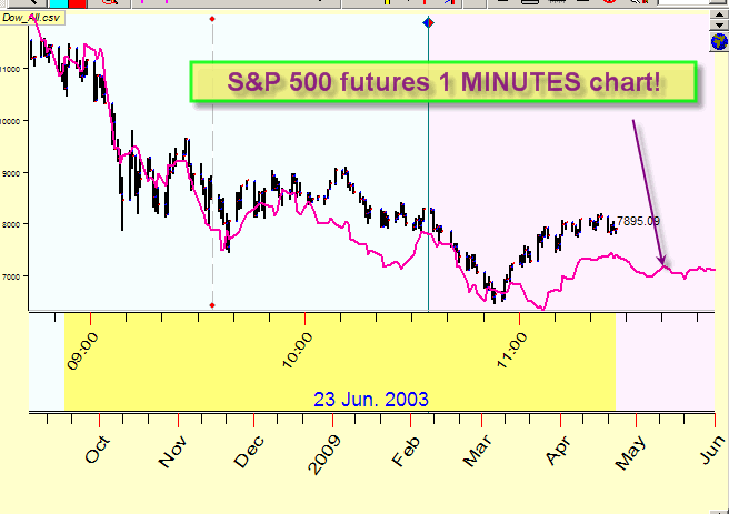
You may try as well to compare the financial instruments with different time frames. This experimental technique still has many questions - I do not know why minute ticks have sometimes the same patterns as daily ones. See the example; here the current DAILY chart is shown together with ONE MINUTE price chart for S&P 500 futures:
And One hour S&P 500 chart corresponds to 3 months of daily Dow history.
And more ...
We provide the library of different financial instruments that you can use to compare with any of your downloaded price charts. The most important feature of this module is that it works extremely fast. This is really important. Within a very few minutes you can compare your chart with dozens of financial instruments. It is fast enough to run this module of the program in a real time regime. With every new price bar coming, this module recalculates the most similar price charts. Consider this example: when analyzing 1-minute price chart and comparing it to S&P500 futures1 min chart, the program analyses 900.000 price charts and looks for the most similar one to this current moment. And this huge calculation takes only 3 seconds of your time!
Technique
Now let us show you how to calculate all these charts.
Run the program and download price history data. For example, it
could be Dow Jones
Industrial Daily
Then click on this button:
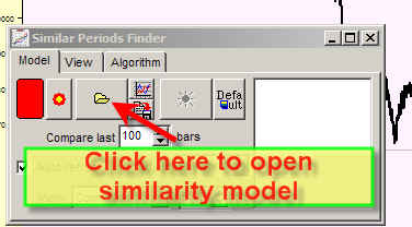
and click here to open a similarity model:
You will get the library of similarity models, choose any of them say "NY Light Crude Oil Daily".
In a few seconds you will see this picture in the Main Screen:
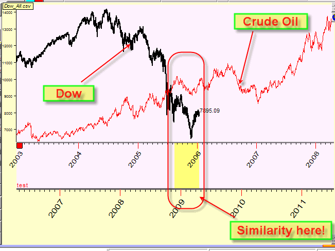
The program shows that there is some similarity between Dow now (April 2009) and Crude Oil in the beginning of the year 2006. This similarity period is marked by yellow bar in the Main Screen. Let's magnify this piece of the price chart to see the details:
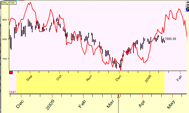
Here the program shows all found periods when pieces of Crude
Oil data in the past were similar to those of Dow now:
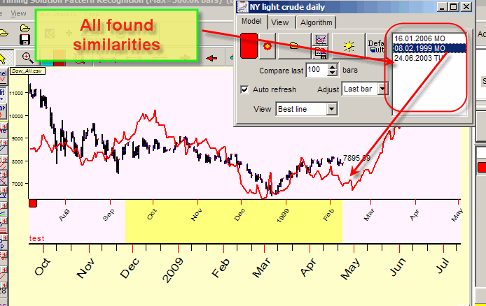
Highlight any of these periods to see the similarity pattern in the Main Screen (the picture above shows the similarity between Dow now and Crude Oil in the year 1999). Try another period. The according chart will be displayed in the Main Screen. Where the similarity period ends, you get your hint regarding the future movement of Dow. We may make the assumption as the price chart for Crude Oil continues, and we can rely on it. So, instead of calculating the projection line, you make a reasonable guess.
You may keep going between the periods of similarity and consider them one by one. Or you may try something else - Committee technique (it is a very popular feature of Timing Solution).
Select "Committee" option; the program displays all found similarities together, on one screen:
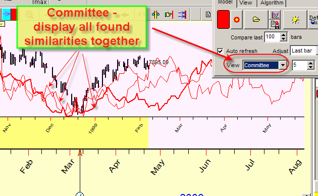
Here pay attention to the moments when all (or majority) of the price charts used for comparison point in the same direction. It means that a strong possibility exists that Dow might go in that direction as well.
You may specify the interval for comparison. In the example below, only last 100 price bars of Dow data are used to be compared with Crude Oil chart. 100 price bars means 5 months. Let say that we have found a model and the similar periods. Now let us expand the initial interval. Do it this way:
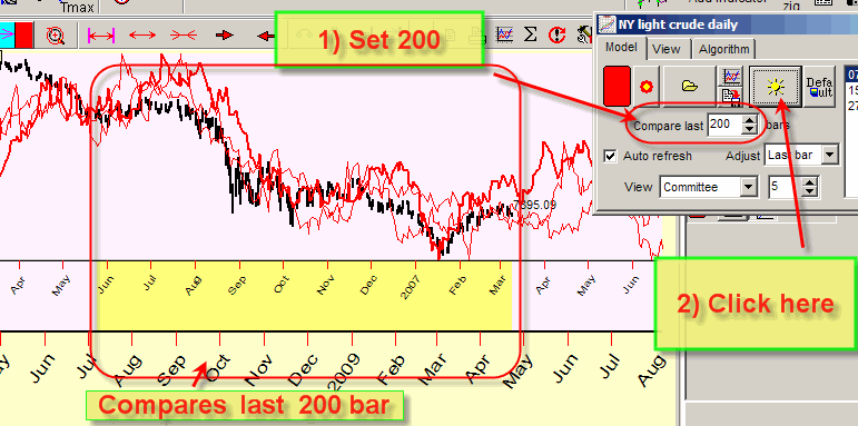
Now the program compares the last 200 bars; the according similarity period is marked by yellow bar.
There are other useful features in this module. Here is the list of them:
Self similarity - Click on this button:
The program starts working in the "self similarity" mode. Instead of comparing different price charts (like Dow and Crude Oil), it is looking for the similar patterns using only the downloaded price history.
Customized models - Click on this button to create your own similarity model:
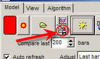
Simply choose the file with the price history to be compared with and name the file.
For real time set "Auto refresh" option ON. The program will recalculate similarities when the new price history data come:
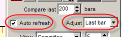
For back testing set "Adjust" parameter to "LBC":
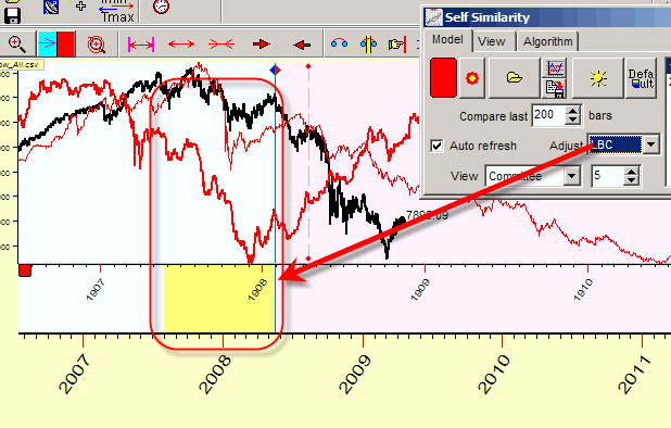
In this case the program will find the similar patterns using %X bars before LBC (not last %X price bars as in the examples above).
Thus you can vary LBC position and watch the similarities price charts comparing them with the real price movements after LBC.
Averaged Committee line, Synergy factor (upgrade May, 4 2009)
When you work with committee, it is a good idea to create a kind of forecasting consensus that reflects the most common movement of committee lines.
It is an obvious idea: if committee lines show the same movement, we have a strong confirmation regarding this future movement. See how Timing Solution Pattern Recognition does this.
When you display the committee, the program shows averaged committee line. This line is marked here by teal color:
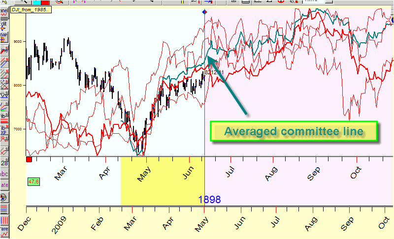
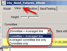
It shows the averaged movement of all displayed committee lines. In "View" tab you can adjust the view of committee/averaged line:
Next question is how we can rely on this committee line? In order to answer this question we use synergy factor, it is displayed in the left part of the screen:
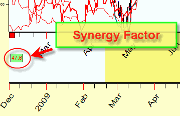
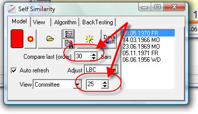
This factor is changing from 0 to 100. When this factor is low (25 and lower), we have the situation when all committee lines move in totally different directions.
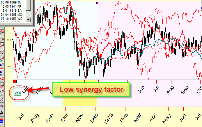
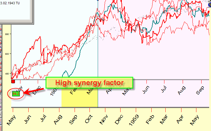
Look at this chart; all four lines here move differently, the synergy factor here is low (23.8).
Below you can see another example with high synergy factor 84.2, all four red lines point approximately at the same movement:
Thus we recommend to use the averaged committee line with synergy factor higher than 50. If synergy factor is low, it means that there is no similar movement, all committee lines point in different directions. In other words we better not using this line.
Pay attention to "Bars after LBC" parameter as well. It shows how many price bars after LBC are used by the program to calculate the synergy factor:
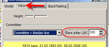
This parameter should be decreased/increased if you are interested in shorter/longer forecast. For example, if you need to get forecast for a shorter term than what is set on the picture above, decrease this parameter (say 50 bars after LBC instead of 300).
My recommendations are based on backtesting done recently.
Here are the preliminary results for daily data of Dow Jones Industrial Index:
averaged committee line works better;
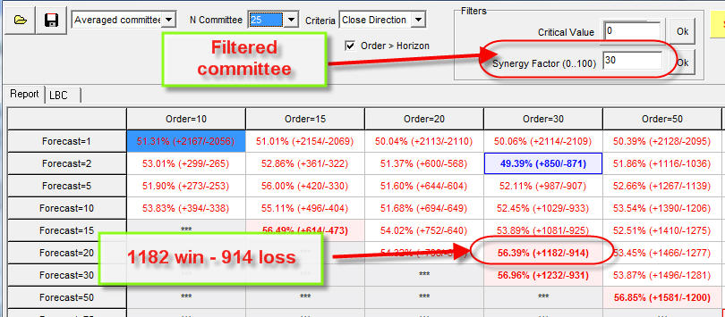
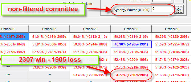
filtered committee line with synergy factor 30 and higher works better than non-filtered (see the pictures below).
Filtered committee line:
non-filtered:
In this particular case the averaged committee filtered line shows the correct movement for 20 bars ahead (i.e. one month) with the probability 56.39%.
Here are the parameters for this projection line:
Leading, Lagging and Coincident indicators
According to the economic theory, S&P 500 is one of the indices that "feel" some improvement in the economy well ahead. When the economy improves, this the first one to grow; other economical indicators make this fact obvious only several months later. Then the labor market improves, and the growing economy pushes commodity prices. This is a chain of natural economical events that form Business Cycle. The most important fact is that S&P 500 is the first one to "see" these changes. This is why this indicator is called a LEADING indicator. There is about a dozen other economical leading indicators (like building permits, money supply), but this one deals with the stock market only. Vise versa, a LAGGING indicator changes after overall economy. A COINCIDENT indicator changes about the same time as the overall economy.
It is obvious that we are most interested in searching the leading indicators as a tool to anticipate the stock market behavior.
It was the theory; let us go to practice.
I start with some examples:
Look at the graph below. There the last year crude oil price correlates very well (no lag) to Dow Jones Industrial index (black - Dow, purple - Crude Oil):
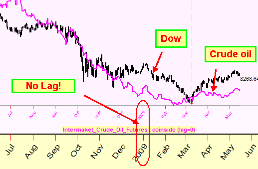
Last year Crude Oil went together with Dow forming a kind of "oil trap". When Dow was up, Crude Oil was up too; and when Crude Oil went down, Dow did the same thing. These two indices are a good example of coincident indicators. Looking at one, we could say about the other - at the same moment; it might be a sign that the economy is looking for new market segments, some new ideas for the next decades.
We would like to see non-coincident indicators. And we are in a better position now than we would be fifty years ago. The modern stock market is much more sophisticated, and we can use for the analysis many different financial instruments, domestic and international.
As an example, see the diagram of Japanese Yen shifted to 235 bars ahead in respect to Dow (they are shown together: black - Dow, red - shifted Yen):
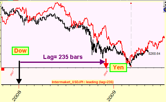
There is a correlation here between the two. Due to the time shift, in this case Yen can be considered as a LEADING indicator with the lag equal to 235 bars. I do not know what economical nuances are behind this relationship (the cheap Yen makes Japanese products more attractive in comparison to USA products, though later on (in a year; one year=250 bars) we have a reversal effect).
One more example shows INVERTED gold (the yellow line) together with Dow (the black line):
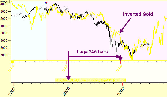
The gold price works as INVERTED LEADING indicator with lag 245 bars.
So, modern technologies allow to look for leading indicators everywhere. And this is what Timing Solution Pattern Recognition (Intermarket Analysis) does.
Technology (How it works)
Now we start working with Intermarket Analysis module.
Before doing anything, remember that:
This module works with daily, weekly and monthly data only;
You should use synchronized data only. In other words if you plan to make a forecast for Dow today (May 22, 2009), you should use indicators that contain historical data till today's date; the difference can vary within a month. For example, if you choose to use Gold to conduct intermarket analysis, you should update the Gold price data at least till April 22, 2009, better till last week and much better till today.
As a simple example, run "Intermarket_Example.wts" worksheet:
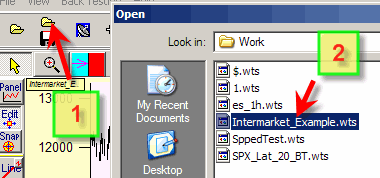
You get this window:
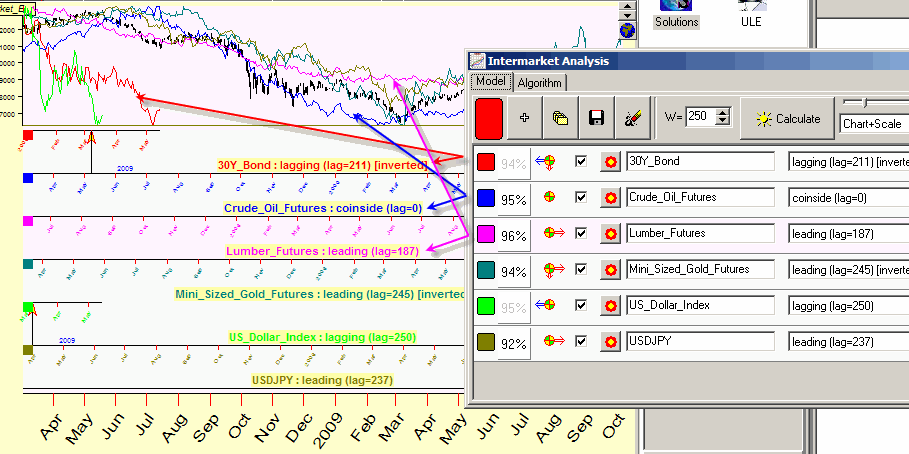
Here the program has downloaded Dow data and has analyzed 6 different indicators in respect to their ability to forecast Dow. It (the program) analyses each indicator separately and shows its Leading/Lagging/Coincident status.
Let's consider this line for US dollar index:
![]()
Dollar index works as a lagging indicator for Dow (lag equal 250 bars). BTW
it means that we can use Dow to predict Dollar Index (Dow is LEADING
indicator for Dollar Index)
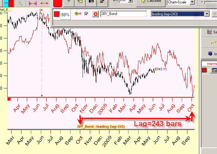
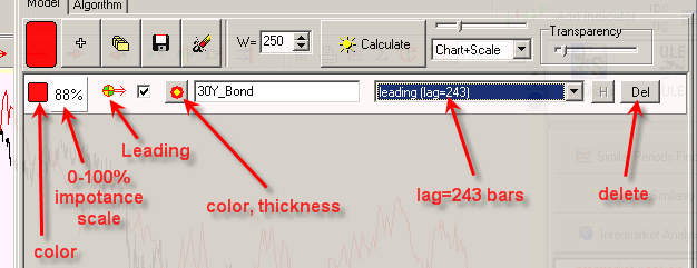
Another line for 30 years bond:
![]()
Bond works as lagging inverted indicator.
For crude oil we have coincidence with Dow:
![]()
Japanese Yen is a leading indicator:
![]()
You are more interested in LEADING indicators, so pay attention to the indicators marked by RIGHT ARROW icons:
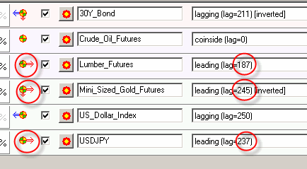
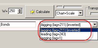
Also pay attention to this menu: some indicators can be considered as lagging and leading at the same time:
As an example, 30 year bonds can be considered as an inverted lagging indicator (lag 211 bars) and a leading indicator (lag 243 bars). I recommend to explore these options manually; the formal math approach does not see all nuances that any trader sees.
Conducting your own Intermarket Analysis
Download the price history for the financial instrument that you are researching. Then define the financial instrument/instruments (or any other indicator) that will be used for Intermarket Analysis. You may choose more than one.
To download these instruments, click "+" button:
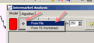
There are two possible options there: text/Metastock/CSI files or e-Signal datafeed. Choosing "From File" option, you will get the standard Timing Solution window to download the price history.
If you plan to use e-Signal datafeed, you must run e-Signal Data Manager before downloading:
When you choose "From TS Worksheet" item, the program will download the price history from existing TS worksheet file,
IMPORTANT NOTICE: if the chosen TS worksheet assumes the updating of price history, the program performs this update. If not, it is your responsibility to provide synchronized data for the analysis.
In c:\TimingSolution\Intermarket\ directory you can find some instruments suitable for Intermarket Analysis:
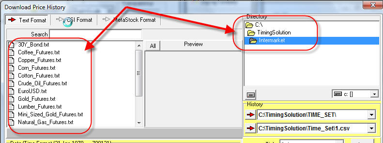
We recommend to put your own files into this directory, the program uses this directory "as default" directory for Intremarket Analysis files.
Now, set "Window" parameter; this is an interval used to conduct Intermarket Analysis. I recommend to use 250 bars (which corresponds to one year for daily data- Annual Cycle). It is better to tie this window with the most important natural cycles:
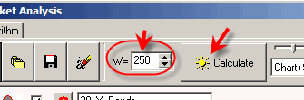
Clicking "Calculate" button you will get the results of calculations similar to this:
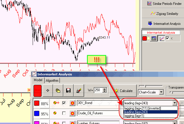
I recommend to vary these parameters; the program automatically refreshes Intermarket diagram in the Main Screen.
This is how 30 years bond works as LEADING indicator with lag 243 bars:
Here is the explanation of the options used in Intermarket Analysis:
Timing Solution Pattern Recognition together with Timing Solution
This software is 100% compatible with Timing Solution software. In other words, if you have them both, all abilities of Timing Solution are available for you when you are working with Timing Solution Pattern Recognition. Just save the models that you have created with Timing Solution into TS Worksheet file (using these buttons):
After that you can run Timing Solution Pattern Recognition program and open there your worksheet. It will open models created in Timing Solution, and you can use them to compare price charts. (Remember that Pattern Recognition does not provide the means to create models; it is the ability of Timing Solution only. With TS Pattern Recognition, you can open only those windows of Timing Solution that were involved in the process of creating your models. Even customized models are based on something provided by Timing Solution. However, Timing Solution Pattern Recognition allows to work with charting tools and ULE module).
To order this software, click here: http://www.timingsolution.com/TS/Order_Form/
Sergey Tarasov
April-June, 2009
Toronto, Canada