Lesson 7
Split criteria and Correlation criteria: how to pick up the most important cycles
In the previous lesson we have learned how to create a projection line based on astro cycles. It is our main goal - to be able to create the projection line of the future movements for each and every financial instrument. However, there is a very important question there: why should we trust our forecast? It leads to another question, more relevant to our lesson's theme: how reliable are astro cycles if we use them for trading? There are two sets of criteria in the program that provide the answer to this question.
Split criteria
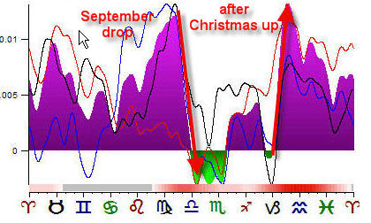
Let us consider again the most known of astro cycles, the Annual cycle. We have found already that there is some connection between this cycle and DJI (it is what I mean saying that "the Annual cycle affects DJI"). Look one more time at the Sun's composite diagram:
Consider two significant moments here (they are marked by red arrows). We can state that there are two major seasonal movements: September drop and after Christmas growth. But - remember that this is the average picture only; it is based on 120 years history. During these 120 years, American stock market has come through a lot of changes. So the seasonal cycle in the beginning of 1900 worked differently than in 1950th and totally different than in the beginning of 2000.
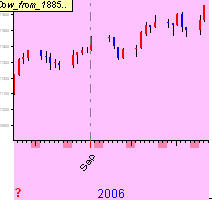
More over, if we look at the price chart of DJI for September 2006, we will not see the big drop, it simply does not follow the Annual cycle:
Why has it happened? My guess is that the "economical gears" change with the time, so does the stock market as well. Globalization makes the national economy less dependant on a seasonal component than 50 years ago. Timing Solution allows you visually see the evolution of the Annual cycle.
Let us look at the September drop in details. There are 3 colored lines on this diagram: red, green and blue ones. These lines represent the composite diagrams calculated for different independent intervals ("independent" here means that the program takes three different time intervals among the available data, of the same length, and not overlapped). The red line represents the last 40 years of history, i.e., the Annual cycle based on 1966-2006 DJI history. The blue diagram is based on 1925-1966 while the black one is based on 1885-1925 data.
If these three curves would point at the same price movement, we may think about high probability that this movement will actually take place in the future. In reality we see that the red line based on the latest 40 years history does not show a strong drop, while blue and black curves point on it. It looks like the September pattern is not so strong now as it has been before. However the DJI still "remembers" this pattern, though the new tendency and new factors are coming to the stage (I would say it has started in September 2004, partly in 2005).
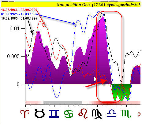
Now, let us consider another pattern, after Christmas upward movement. Here you see all three lines pointing at the same direction, and (what is very important) at the same turning point happening on January 5-6, 2007:
The program is very flexible: you can analyze any amount of independent intervals among your data (use "Split" option), for different cycles and different Zodiac types. It does not matter how many composite curves you have; the most important thing is to watch the intervals (or zones) where all these curves (or most of them) show the same price pattern.
The zones where all three curves (or any other amount defined by you) point at the same movement are called predictable zones. To identify them easily, these zones are marked by red color stripes at the bottom of Composite diagram:
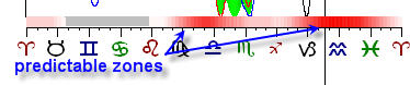
When any planet (or the angle between the planets) reaches this zone, we should pay a special attention to this astro cycle.
Therefore, when you study astro cycles, first of all you must watch how these three curves move together. If they point at the same tendency, we can accept this cycle for further consideration. For example, analyzing Dow Jones Industrial from 1885 year, we have found this Venus synodic cycle (phase zodiac):
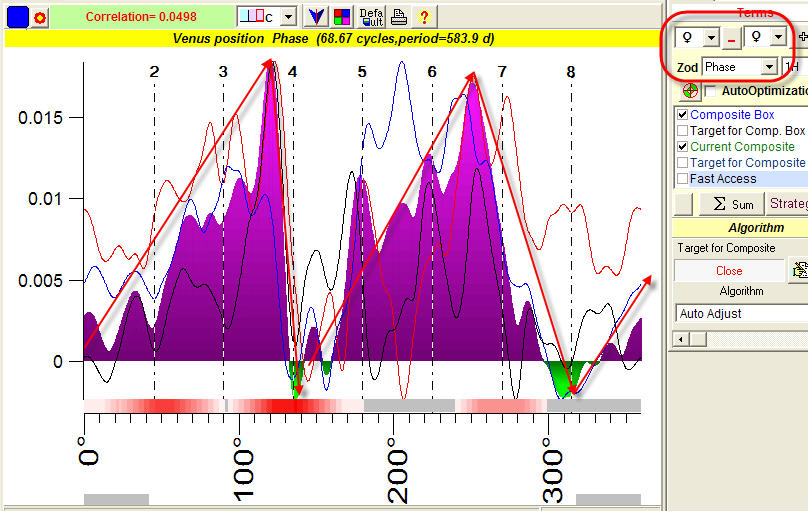
As you see all three curves point at the same tendency. The discrepancy still exists, but the general tendency is visible. By the way, this cycle is not found by Spectrum analysis; very often the Spectrum cannot reveal this kind of cycles.
Vise versa: if we watch Saturn synodic cycle with a period of 378 days, we cannot find any tendency there:
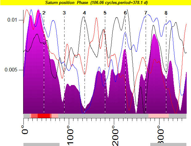
So, we will not consider this cycle further.
We call this approach split criteria, when split curves show us some tendency, we can accept this cycle as a valid one in the terms of split criteria. You may use this cycle for your forecast.
The split criteria approach is a "qualitative" one. Some of you may find it time consuming. However, I recommend you to play with the astro cycles actually. After some practice you will get a better feeling and understanding of these cycles. Under this approach, you use your own judgment and evaluate a cycle visually. There is another approach, a quantative one - when the computer calculates some parameters and provides you the information for your decision.
Correlation criteria
Before discussing this approach, I would like to make it clear why we use correlation at all. Correlation is not a final answer. Sure the higher correlation the better, However, as for today, there is still no theory or idea that explains market moves in a most realistic way; we do not know the reason. Thus, the regular way of academic science is not applicable here (like gather data, do this, check that, and you will get something). We have to go by phenomenological (pre-scientific) way - gather the data, try one method, compare its results to the reality, store the results, apply another method, etc. The stock market has so many faces/habits, and we can only study these faces/habits. A time for a theory will come...
Back to astro cycles. I prefer to use several criteria in determining the influential cycles. The second method is correlation criteria. The idea is pretty simple: we calculate the projection line based on analyzed cycle and watch how this projection line fits to real price (to be precisely, not to price itself, but to its oscillator). The correlation is calculated on the testing interval (red zone), this is important. (It is important because the correlation on a training interval has no sense - it is high by definition.) The higher correlation, the better for forecast - it means that the cycle with a higher correlation has more chances to move the market.
So, researching the Venus cycle, pay attention to a correlation coefficient:
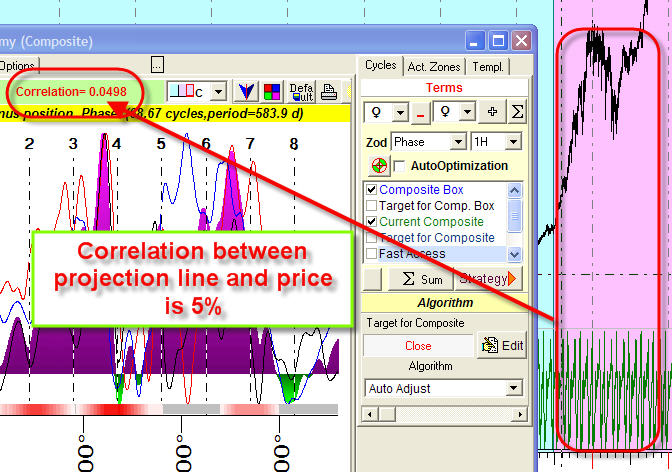
If this coefficient is positive, we can accept this cycle as an important one. The correlation 0.03-0.05 is good enough. More detailed explanation regarding the correlation coefficient see in the program's documentation.
Thus I recommend two steps while choosing the cycles for your forecast: checking the split criteria and checking the correlation criteria.
I would like to add only this: do not be discouraged by 3-5% of correlation. It does not mean a forecast's success (it is not about the forecast quality). It means only that your cycle is responsible for 5% of all market moves - among all other reasons that might move your market. Is it big or is it small? I think it is big enough - it is just one cycle among many. By the way, the modern civilization, with all its cars, trains, airplanes, rockets and all appliances that we used to have - has started with a steam engine. Do you know its original efficiency? Find it yourselves, it will be a good surprise.