H-Spectrum - cyclical portrait of American stocks for the last 24
years
written
by Sergey Tarasov
H-Spectrum: how to do that
H-Spectrum stands for
"histogram based" spectrum. To get it, we start with calculating a
periodogram. Below is a sample of the periodogram. It represents the cyclical
activity, or, we can say, shows the most common cycles that can be found in American
stocks price charts since 2000 (i.e. for the last 24 years):
This is a very detailed chart;
it involves huge calculations. To get this sample, we have calculated
periodograms for 12 American stocks (Bartels-Tarasov algorithm was applied), on
different randomly chosen time intervals. By moving the LBC (learning
border cursor ), the data interval used for
calculations covers a period since the year 2000 till 2024.
Let us start calculating a
periodogram just for one stock. The program automatically has extracted the most
important cycles for its price chart; these are seen as peaks on the
periodogram. This is how a typical periodogram for one stock looks (JPM; LBC
set to April 2020):
Vertical stripes represent the
most significant cycles revealed by the periodogram; its peaks indicate the
cycles that accumulate more energy.
We can do the same for any
American stock. We can do that for all American stocks, one by one. As a
result, we get a huge list of cycles that were found for these stocks. We can
get a library of those cycles. We will see there that some cycles appear more
often than others. It could be a research project - looking at each cycle
separately and selecting those that are relevant for several stocks, groups of
stocks, etc. Finding a cycle/cycles that work for many
stocks sounds like a promising idea. However, it is too time consuming while
its outcome is unclear.
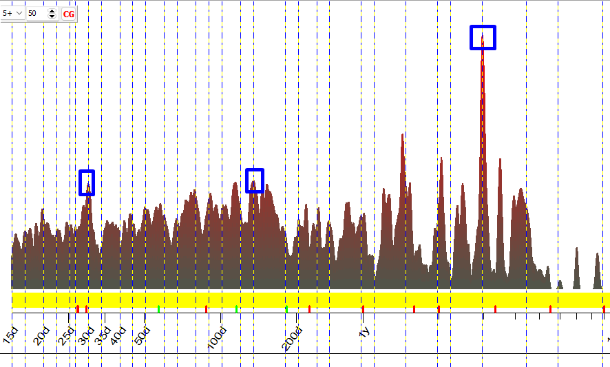
To get some confidence of our results we can display several periodograms
together to see what cycles appear more often. Here are four periodograms
displayed together; these are calculated for different stocks and LBC
positions:
The red chart in the bottom
panel is a summary chart. It is called H-Spectrum. As you can see, it shows a peak around 2 years cycle; this peak
reflects the fact that this cycle is present in all these four periodograms.
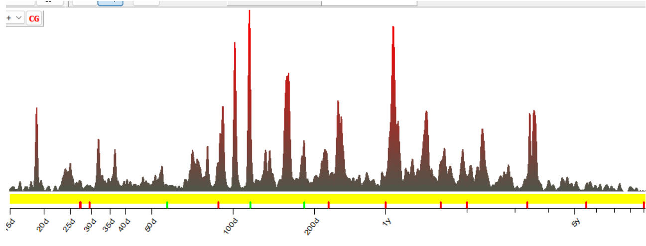
Adding 4 more periodograms, we
get H-Spectrum based on 8 periodograms. It
reveals 95 different cycles. And you can see there two peaks now, two the most
common cycles for these 8 periodograms - 2 and 3-years cycles:
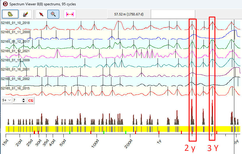
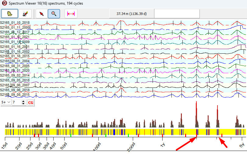
16 periodograms reveal 194
cycles; the final red chart looks even better:
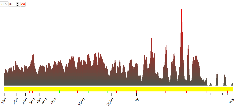
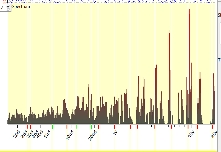
To get the full picture, we
have analyzed 4695 periodograms (for different US stocks and different LBC
positions). These periodograms take into account 56K
cycles. The final histogram is based on 56K cycles; it looks very sufficient
from the statistical point of view:
It certainly shows some
clusters, some zones where cycles appear more often.
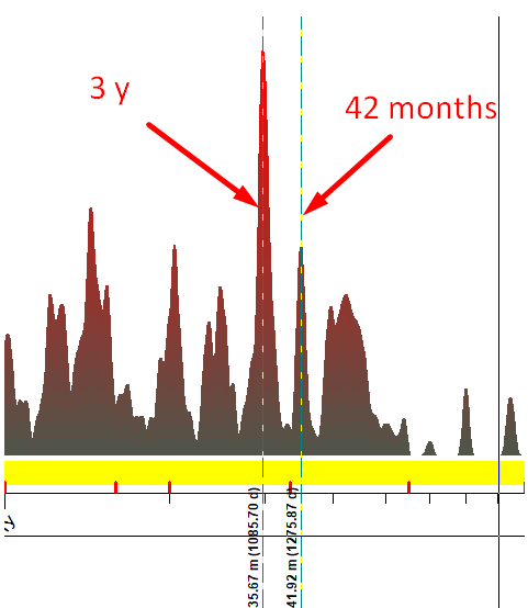
I was surprised to find a
3-years cycle as the most often appeared cycle, I expected to see there 40-42
months Kitchin inventory cycle that is revealed by classical cyclical analysis.
The Kitchin cycle is present there, it is also strong, though not so strong as
3-years cycle:
In the demonstrated approach we
applied a combination of classical cyclical analysis (by calculating
periodograms) and statistical analysis. As the result of this combination, we
have got a special type of Spectrum, H-Spectrum. It is a histogram that visualizes a frequency of the
appearance of different cycles. This is not a result of some activity of AI
(Artificial Intelligence, the software users often ask about that), this is a
kind of big data analysis or data mining.
As to my knowledge, we (Timing
Solution team) are the first who applied this approach. In 2017, while working
on stocks genome (see this article: https://www.timingsolution.com/TS/Articles/Genome/index.htm
), I tried to present the frequency of cyclical appearance as a histogram
chart. It is possible that someone else did that, too, though I have not seen
any referral to such approach among scientific papers that were available to me
at that time. The closest approach I was able to find is M.S. Bartlett and P.D.
Welch's method of averaged periodograms. There is a significant difference
there: we analyze histograms for extracted cycles while Bartlett/Welch are
focused on smoothing a set of periodograms.
H-Spectrum: H means Histogram
Soon after the introducing this
feature to Timing Solution community, H-Spectrum became one of the most used
tools of the Timing Solution software. I would like to explain in details how it works.
H-Spectrum = Histogram Spectrum
is, as it is assumed by its name, just a histogram, or the distribution of
cycles in regards to their periods.
You can easily visualize the
idea of a histogram. Imagine a set of bins. And a big bin with the balls of all
sorts and colors, like this one:

The balls in the big bin are a
mess. We can sort them, using those empty smaller bins. We put orange
basketballs into one bin, baseballs into another, foot balls into the third,
red, green, other ones - into other empty bin
accordingly. Now we see and we can say how many balls of each kind we have.
The same idea is for the cycles
that were extracted from the price charts. We put them into appropriate
"bins". Let say that the Spectrum module has revealed a cycle with a
period less than 10 days; we put this "ball" into the first bin (have
you noticed - I am not using "" for the bin, as it is a regular term
for an element of a histogram?). If the cycle's period is between 11-20 days,
we put the ball into the second bin. And so on.
Filling the bins, we process
all our periodograms/revealed cycles. The most loaded bins correspond to the
most common cycles, cycles that appear more often than others.
Usually a histogram is presented this way (this
image from Investopedia is included for illustration purposes
only; the original was applied for some other need):
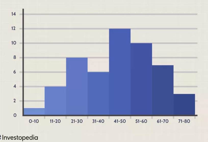
Here the height of the first
bin (0-1) is 1; it means that only one cycle with a period no more than 10 days
has been found.
Cycles with periods 11-20 days
appear more often: 4 of these cycles have been found.
The most typical cycles are
41-50 days ; 12 cycles found, 12 balls in the bin.
Thus you can easily see more or less typical
cycles. The amplitude of H-Spectrum just shows how often some cycle appears, it tells you nothing about the amplitude of these
cycles.
H-Spectrum module in
action
There are several ways to use
H-Spectrum module:
1) H-Spectrum for single
instrument (vary LBC only)
Firstly we can apply H-Spectrum for a single
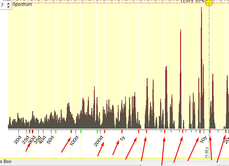
financial instrument. Here is an example. I have downloaded Dow Jones
Industrial since 1885, opened TS Spectrum module and did this:
It takes 30 minutes to complete
these calculations. As a final result we get H-Spectrum
for DJIA index. It shows the most typical cycles that appeared in DJIA chart
since 1948, i.e. we vary LBC position since 1948 till now (may
2024) and watch the cycles that appear within this period:
We analyze here temporary
cycles, i.e. cycles that live (i.e. can be observed within) some restricted
time only. This is why we need to move LBC position to see how historically
often these cycles appear.
The chart also shows that we
are "in the right direction": practically all the most important
cycles revealed by spectrum (they are marked by red arrows) have peaks on
H-Spectrum chart:
This tool is very good to confirm economical cycles. It is especially helpful
for financial data where the effect of heavy tailed statistic is very
important.
Briefly, this effect appears in
the situations when we see a peak on some periodogram calculated by classical
spectrum. That may be a result of some unusual price movement caused by some
extreme and rare event, or it could be a strong cycle that worked for a very
short period of time. The statistical significance of
this cycle is very low, i.e. with high probability we may consider it as some
occasional movement. Still, this peak on periodogram is very high, and we
should not ignore it. H-Spectrum algorithm is free of this problem.
2) Multiple financial
instruments (vary financial instruments and LBC)
The application of histograms
for cyclical analysis opens some new possibilities. We can calculate H-Spectrum
that gathers information from very different sources such as typical
periodograms for different American stocks calculated for different time periods.
Or another variation: we can calculate H-Spectrum that shows the recent
cyclical activity of American stocks based on 1000 American stock charts (this
is Cyclical Genome spectrum, available in Timing Solution; it will be explained
later). Classical Bartlett's method of averaged
periodograms does not allow to do that.
I would like to remind you
about this guy, Maurice Stevenson Bartlett:

Maurice Stevenson
Bartlett (1910 - 2002), English statistician
He studied and worked with many
great minds of the XX century. He made significant contributions to the
analysis of data with specific patterns contained. I have already mentioned
Bartlett/Welch method of averaged periodograms. It is the closest that I have
found to what we do here. However, this method does not allow to do things that
we can do with H-Spectrum. When calculating the averaged
periodogram, we drastically lose spectral resolution, especially on big
sample sizes. H-Spectrum works with extracted cycles, not with the periodogram
itself. This fact dramatically increases the resolution, especially on big
sample sizes. We can take H-Spectrum as an application of Maurice Stevenson
Bartlett ideas prolonged into the computer epoch when new computation
capabilities became available for researchers.
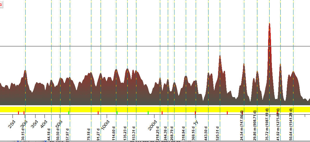
To calculate our first chart of
this article, the chart of cyclical activity for 12 American stocks since 2000
till now. - we have calculated periodograms for
these stocks varying LBC position since 2000 up to May 2024. In other words, we
vary here both - the analyzed American stocks and LBC positions. The resulting chart represents the
general cyclical picture for American stocks for the last 24 years.
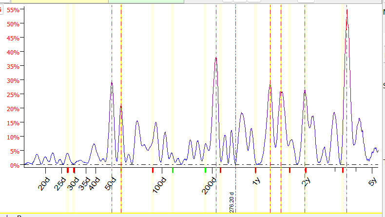
As you can see, the most
important cycles here are 30.15 days, 44.18 days, 50.50 days, 57.97 days. and
so on; they are marked by vertical lines:
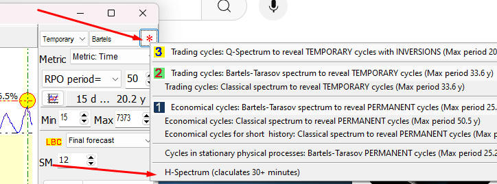
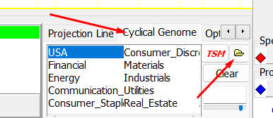
This H-Spectrum is available
for Timing Solution software users. It can be downloaded through TS Spectrum
module "Cyclical Genome" panel, by clicking this button and choosing
the file "Ameerican_Stocks_2000_2024.spectr":
BTW, I have not found any
certain confirmation that E.R. Dewey's cycles work. Dewey cycles are marked
here by vertical stripes:
It is possible that I have
incomplete information regarding Dewey's cycles. This issue requires more
research.
3) Cyclical Genome (vary
instruments only)
For traders' needs, this is the
most important feature. We do not play here with LBC. We use the latest price
history and conduct cyclical analysis for one and the same time
period. And we do that for as many stocks (or other financial
instruments of the same kind) as we want. In practice, this is what the program
does when we work with Cyclical Genome (CG): it
conducts cyclical analysis for some stock on a certain interval (the latest
price history is used). As a result, some cycle's presence is detected. Or
several cycles. Should we trust this cycle/cycles? Some additional confirmation
would be very helpful. In order to get this
confirmation, we keep calculating spectrums for hundreds and hundreds of
different stocks and watch if this cycle shows up in these stocks.
Look at the chart below. This
is Cyclical Genome (H-Spectrum) calculated for 1000 different American
stocks. It is created to reveal cycles that worked since March 2023(LBC set to March 2023):
We see here that some cycles
are present in the charts of many American stocks. It is not a surprise as the
companies operated in the USA are connected in many ways. If there is some
cyclical pattern for one company (found by calculating the spectrum for its
price chart), it may have some impact on other companies, the vendors or clients of the first one. This is the additional
confirmation regarding cycles that we need.
To calculate Cyclical Genomes
is an enormous computation task. That is why we perform these calculations
aside the software, on a specialized Timing Solution Server machine.
With the time, the cyclical
portrait of stocks is changing. Hence we need to
recalculate Cyclical Genome on a regular basis; we do that every other month.
This module can be qualified as a big data analysis system.
Instruction for Timing
Solution users
Working with H-Spectrum, please
remember the following.
Firstly, while you work with TS
Spectrum module, you can save a periodogram and extracted cycles by clicking on
this button (it saves this info into the file with the extension *,spectr):
This is the way to make your
own collection of periodograms, calculating them for different instruments
(stocks, etc.) and different time intervals.
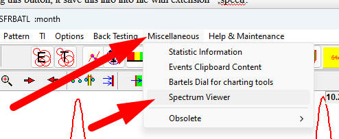
To work with these files, use a
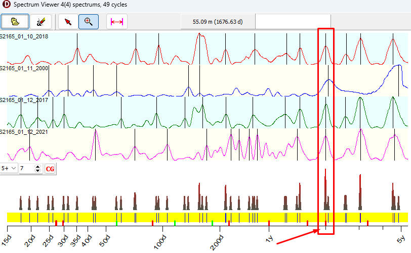
special utility, Spectrum Viewer. You can run it through Miscellaneous
section:
Here is an example of applying
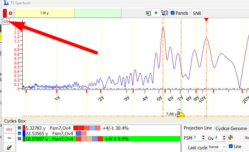
this approach for three major economical indicators.
I have calculated periodograms
(using the algorithm that reveals permanent cycles) for GDP, CPI and
Unemployment rate and downloaded these periodograms into Spectrum Viewer:
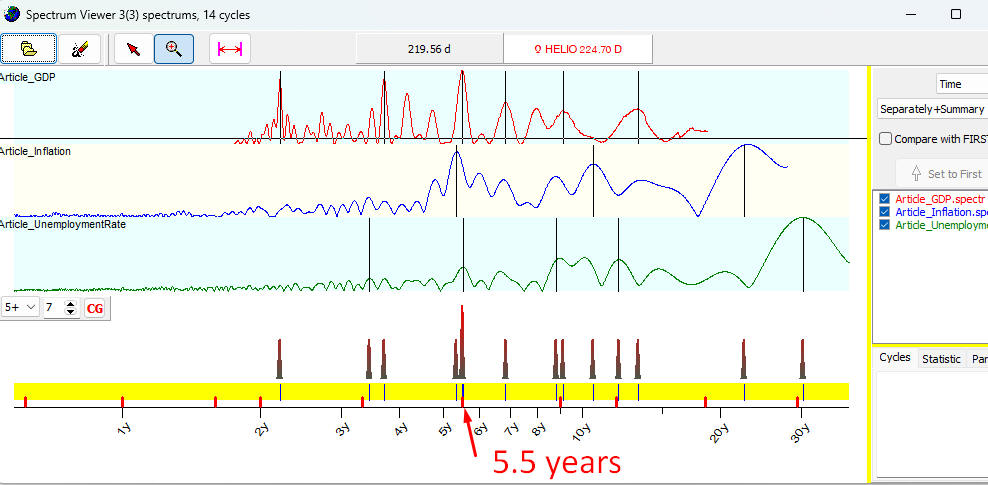
As you see, the cycle with
period around 5.5 years works for all these indicators. H-Spectrum displays the
highest peak there.
You can download into Spectrum
Viewer utility as many periodograms as you need.
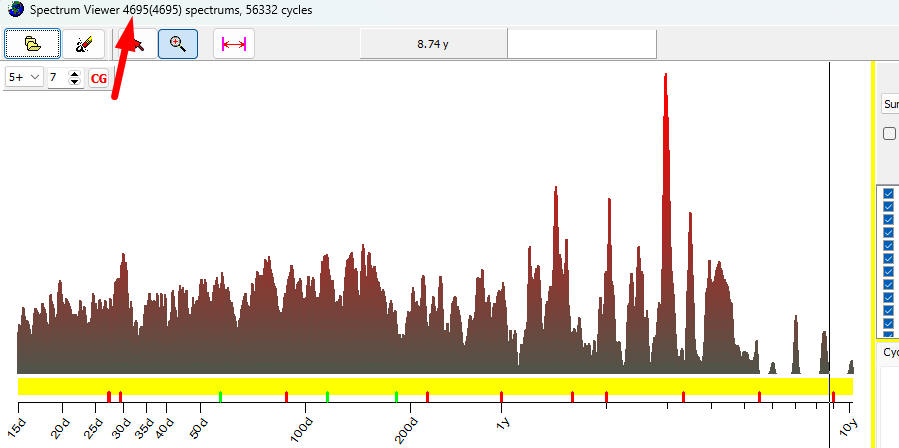
For another example, I have
downloaded 4695 periodograms. The resulting histogram shows a distribution of
56332 revealed cycles:
You can save this H-Spectrum
into the file clicking this button:
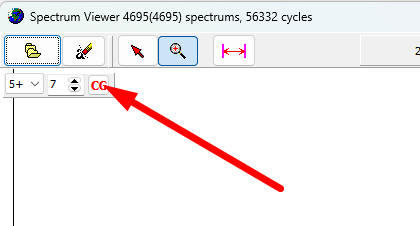
After that, any time you want
you can display this H-Spectrum in TS-Spectrum module this way:
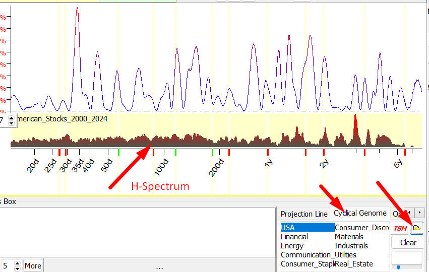
So you can see together the periodogram
calculated for your selected financial instrument and H-Spectrum that shows the
cyclical activity for the whole market.
May 28, 2024
Toronto, Canada