Cyclical Stability in Timing Solutiton
Written by Sergey Tarasov
June 28, 2026
Cyclical Stability in Brief
When you run TS Spectrum in Timing Solution software, the most important information about cycles is displayed immediately and clearly:
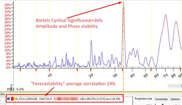
The highest peak indicates the statistical strength of the cycle — how well it preserves its amplitude and phase, and how stable these parameters remain over time.
The colored bars show the cycle’s Forecastability—its usefulness for forecasting out-of-sample data under real-world conditions. The more red bars are shown in the Forecastability chart, the better the cycle performs as a forecasting tool.
This example shows a cycle that is not very good for forecasting: only the last two bars are red (positive correlation between price and the projection line), while the remaining bars are blue (negative correlation).
![]()
This way we implement into Timing Solution the concept of Walk Forward Analysis (WFA) invented by Robert Pardo.
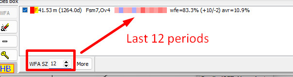
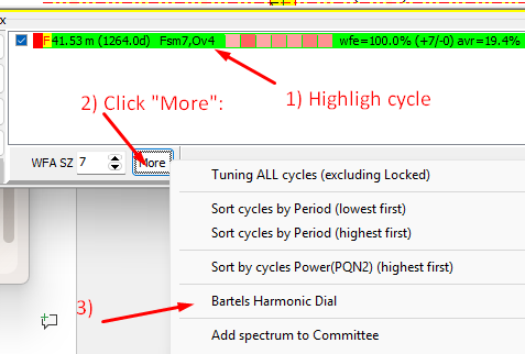
You may increase WFA sample size (WFA SZ) to see how this cycle worked on a bigger historical interval (12 full periods in this example):
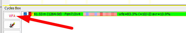
Or by clicking WFA button, you can check the more detailed Forecastability chart:
Here it is; black curve represents the price, while lime one shows the projection line based on 41.5 months cycle:
Pay attention: this is an out‑of‑sample projection line — not a future‑leak projection line. In other words, it is a projection line that does not “know” the future price. LBC (Learning Border Cursor) position takes care of that.
For practical use, this information is sufficient enough, although a deeper research can certainly be conducted.
Cyclical Stability in Depth
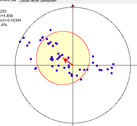
Running Bartels Dial module, you can see how amplitude and phase for a chosen cycle is changing:
This is the Bartels Harmonic Dial calculated for the 41.5‑month cycle applied to the S&P 500:
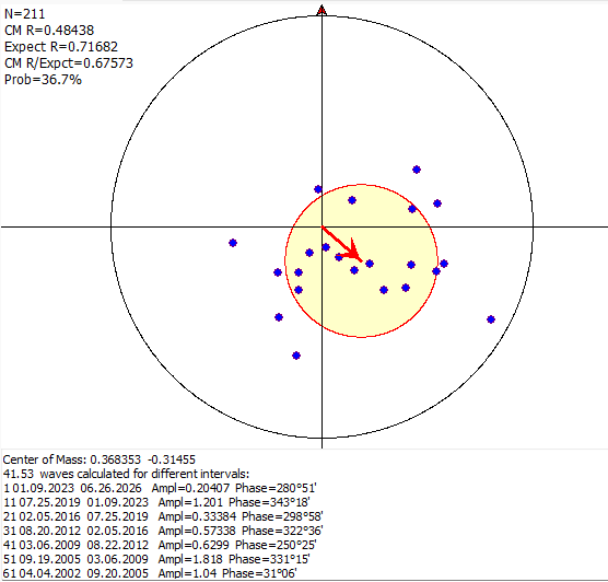
The bottom list shows how the amplitude and phase of this cycle have changed over time.
From 01.09.2023 to 06.26.2026, the amplitude of the 41.5‑month cycle is 0.20407, while the phase is 280°51'.
In the previous 41‑month interval — 07.25.2019 to 01.09.2023 — the amplitude of this cycle was six times larger, at 1.1, and the phase shifted by about 60 degrees, with Phase = 343°18'.
Next interval provides a new pair of data: ![]() , and
so on.
, and
so on.
Having the amplitude and phase pairs, we can construct a vector for each interval. That allows to see how the amplitude and the phase of the 41.4‑month cycle behaved during different periods of time. This is the essence of Julius Bartels’ brilliant idea — the Bartels Harmonic Dial.
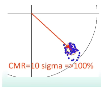
If the cycle is good and stable, its amplitude and phase do not change much; accordingly, the vectors in the Harmonic Dial form a tight cluster, like this:
Conversely, if the cycle is weak or unstable, the vectors are scattered across the entire Harmonic Dial area, like this:
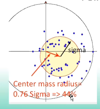
Now the only thing left for us to do is applying statistics to estimate how tight the cluster is — that is, how stable the cycle is.
The idea of Julius Bartels is one of the most exciting concepts I have encountered in my life: https://youtu.be/15Rtp-oAA2g?si=9SNE_ST2N-tWk2wb
Restrictions of Stability
When applying cyclical analysis to real financial markets, we encounter a very different reality. It took me 20 years to understand why promising cyclical techniques often fail under real stock-market conditions, and why financial cycles behave differently from the cycles I observed earlier in my scientific work in nuclear physics.
One of the key problems is the finite lifespan of financial cycles. Cycles in finance live only for a restricted period — typically 5–7 full periods; after that they simply stop working.
The wavelet chart below illustrates how cycles live in time. The SM parameter (Stock Memory) shows the cycle longevity measured in periods:
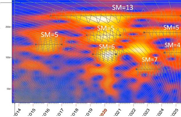
From the other side, we need 4–5 full cycles to reveal a cycle; before that, the cycle is simply invisible to us. As a result, we typically have only 0–2 usable cycles for trading — the period when the cycle is still alive and already detectable.
This fundamentally changes how cyclical analysis should be applied in financial markets. Unlike the traditional scientific approach, which usually deals with cycles of effectively infinite duration, financial-market analysis requires what we call an early cycle‑detection system:
This fundamentally changes how cyclical analysis should be applied in financial markets. Unlike the traditional scientific approach, which usually deals with cycles of effectively infinite duration, financial market analysis requires what we call an early cycle‑detection system:
https://youtu.be/WJ_1ds7UFkk?si=DfnSmdTbUbn6SGTB&t=2356
Inversions
Another limitation arises from inversion phenomena. There are specialized modules in Timing Solution software that allow to work with inverted projections, but many questions about inverted cycles are still open.
In Bartels Harmonic Dial inverted cycle appears as two symmetrically located clusters, two clusters for the cycle, like this: