Spectrum Module and Cyclical Analysis
Items covered in this section
This lesson explores projection models based on fixed cycles. The idea here is that the stock market follows specific cycles. If these cycles can be detected, it is possible to make a forecast based on them. You will learn here how to find these cycles and create a projection line.
Let start with the basics of cyclical analysis. If you are already familiar with it, you may skip this part and move here to learn how ideas of cyclical analysis are applied in Timing Solution software..
Basics of cyclical analysis
A cycle is something that repeats itself in time. The simplest example is a workday routine: you come to work at 9AM, do your duties, have lunch at 1PM, go home at 4:30PM; same schedule day to day. Another example is an annual cycle - from January 1 to December 31; same order of days, weeks and months, year by year. Cycles as a routine take place also inspace (consider a bus route - from station A to station B, again and again).
We can talk about different cycles indefinitely. The good thing with cycles is that they make a forecast possible. If we know that some cycle exists, we can find out where we are in this cycle: and then we can tell what happens in a minute, in an hour, next year, next kilometer, etc.
Scientists and engineers add to the cycle's idea a rational dimension, trying to figure out what is common to all cycles and whether it is possible to apply some quantitative approach. As a result, many cycles can be described by equations and functions. It means that once a cycle is studied, we are able to program it and forecast some activity related to this cycle. This is why scientists love cycles.
The subject of this lesson is cycles that can be described by harmonic functions, i.e. can be represented by some combination of sine/cosine waves.
This is a classic sample of sine (cosine) wave:
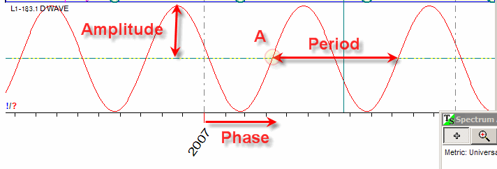
Any sine wave has three parameters: period - the length of the cycle, amplitude - the strength of the cycle (it is represented on the diagram as the height of the sine curve) and phase - the angle that defines the start of the cycle (the start point on the diagram is marked as "A").
Superposition
It is possible to combine various cycles together (combine two different sine waves
as an example). This procedure is called "a superposition of
the cycles". Its result is a cycle as well. The
resulting cycle may look like this one:
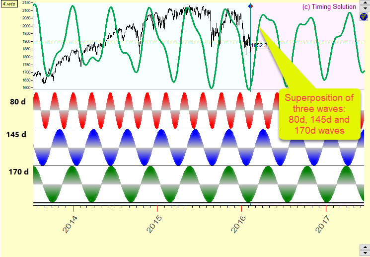
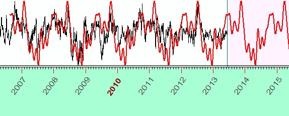
In this case there is a superposition of 80, 145 and 170-days cycles. It is displayed together with Dow Jones Industrial Index chart (a black line). In regards to making a forecast, superposition of the cycles is a very useful thing as normally we have many different cycles working at the same time.
Cycle Weights
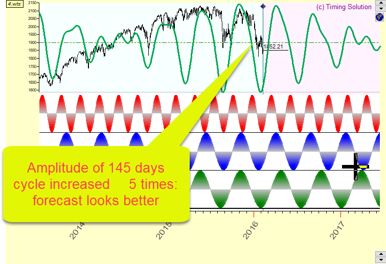
In the previous example the same weights were used for all three cycles. Suppose one of the cycles is more important than others. We can double the weight of that cycle (keep the same period and phase and double the amplitude), changing the appearance of the resulting curve. Thus, modifying the cycle by assigning different weights to its components, we can significantly improve our superposition curve. Let us modify the cycles from the example above: increase the weight of 145-days cycle 5 times leaving other cycles as they are. Now the superposition fits the price curve better than the previous one, thus giving us a better projection line.
Overtones
Another way to improve the cycle is using its overtones. What are they?
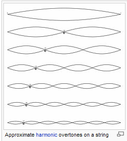
Touch the guitar string; it starts vibrating. How many different sounds do you hear?
First of all, you hear the main vibration of the string. On the picture below this is the upper diagram; it shows the vibration that involves the whole string length. Next, you hear the vibration of half of the string length; it is the next "octave" of the main sound. Then you hear vibrations caused by 1/3 the length of the string, 1/4, 1/5, etc. These "additions" to the main sound are called overtones. Some overtones are louder while others are quieter; it is the reason why every musical instrument makes its unique sound.
Overtones can be used not only in music. They can add something meaningful to any cyclic process. See the difference between a pure sine wave calculated by Timing Solution software and the same wave with overtones - the enriched wave.
This is a 145-days pure sinus wave:
This is the same wave with two overtones:
And below is the same wave with eight overtones:
Nyquist frequency
Scientists and engineers knew the importance of finding a cycle/cycles in a certain process. There was a Swedish-American engineer Harry Nyquist; he has spent a lot of time determining the minimal time interval where it is possible to see a cycle. Nyquist frequency is named after him. The rule is that, based on a type of data you use, the minimal cycle that you may find there is at least twice. It means that if you are working with daily data, the cycle you may find there would be at least two-days cycle; if you work with 15 minutes of data, the shortest cycle to be considered is 30 minutes. Based on the research of Timing Solution team, it is recommended to use 5-7 time intervals, i.e. for daily data use the cycles with a period of 5-7 days, for 5 minutes of data 25-35 minutes cycles, etc. Nyquist frequency is a kind of a door to a kingdom of Chaos. Keep this door locked for now.
Spectrogram
When working with financial instruments, some cycles fit the price chart better than others. It is possible to collect all these cycles and compare how they fit the data. This is represented by a graph that shows the length of the cycle versus how well it fits the financial instrument. A graph like this is called a spectrogram.
A sample of a spectrogram produced by Timing Solution software is shown below:
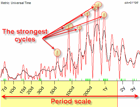
This spectrogram is also called a periodogram. The X axis on this diagram corresponds to the period of the cycle, while Y is the strength of this cycle (more exactly, spectrum density). The highest peaks on this chart indicate cycles that are the strongest in this data set (in other words, they fit the analysed data the best way). The spectrogram simplifies our life: when we have it, our task is only picking up these top cycles and asking the program to make a projection line based on these selected cycles.
Cyclical analysis in action
To find out the most important cycles inside some stock market data set, Spectrum Analyzer (or Spectrum) module has been developed. The following is a description of how to work with this module. There are some steps to do.
Calculating periodogram
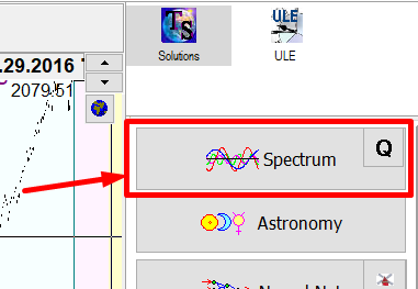
Download some price history data (as an example, it is corn futures EOD continuous data) and click "Spectrum" button:
In seconds, the program makes the diagram similar to this one:
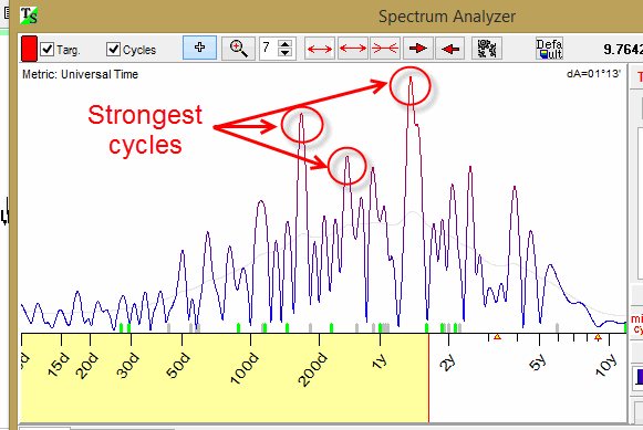
This is a periodogram. It helps to figure out what cycles are present inside this data set and which ones are more prevalent than others.
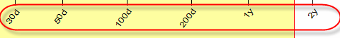
The horizontal X axis shows periods of analyzed cycles; in this example the periods are 30, 50, 100, 20 days, 1 year and 2 years (Your results might be slightly different due to different data interval being loaded):
The vertical Y axis shows the importance of the cycle, or, if you prefer, the energy accumulated in this cycle. Accordingly, the peaks of this diagram correspond to the strongest cycles. These cycles will be used to create a model for the projection line.
Picking up cycle
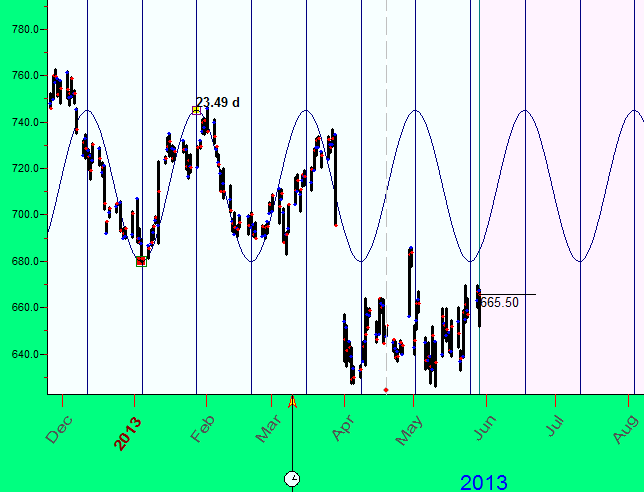
Let's look at one of these cycles closer. There is a peak around 500 days period. Click on this cycle; the program extracts it for the forecast (it is placed in the field just below the Spectrogram):
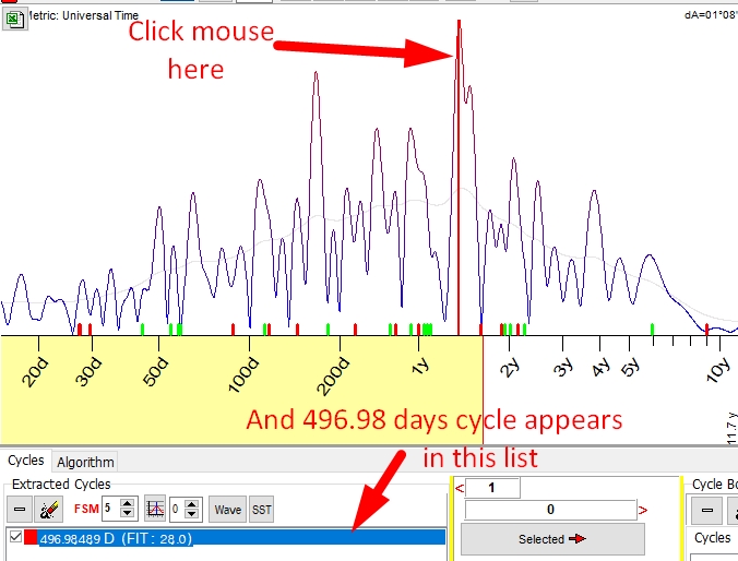
The program also calculates precisely the period of this cycle. In this example, the actual period of the cycle is 496.89 days (not 500). Now look at the Main screen:
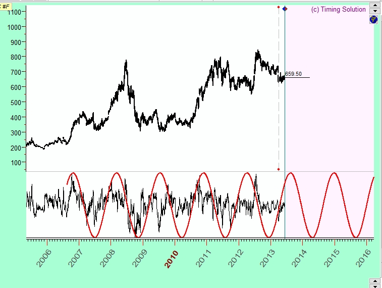
Here the red wave shows how this 496-days cycle works in time. It is a fixed cycle, and its wave can be prolonged for as long as needed.
Playing with overtones
In this example the amount of overtones is set to 1 to calculate a pure sine wave:
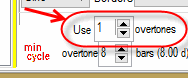
This overtones parameter allows to enrich the main sine wave. Here is the enriched by 2 overtones 496.8-days wave:
3 overtones
The pictures above show that the amount of overtones equal to one gives a pure sine curve; when the amount of overtones is increased, the shape of that 496.89 day cycle wave becomes more detailed, more complex. It resembles the original price chart better than just the sine curve. Still, this curve alone is not enough to cover important characteristic points of the price chart. Maybe, the result would be better if more overtones are used. From the other side, using too many overtones opens the door of Chaos: instead of accuracy, fast harmonics may bring more noise. Look at the same 496.89-days cycle with 12 overtones:
Playing with FSM "life expectancy"
It is good to know that some cycle exists, being able to make its projection. But for how long will this cycle be active? You may have seen already that even a slight change of initial data set could bring to the surface other cycles and dismiss those that you have used as the most important ones. Based on the research of Timing Solution team, it is recommended to pay attention to FSM parameter that represents the time span within which this cycle is active, i.e. the "life expectancy" of the analyzed cycle:
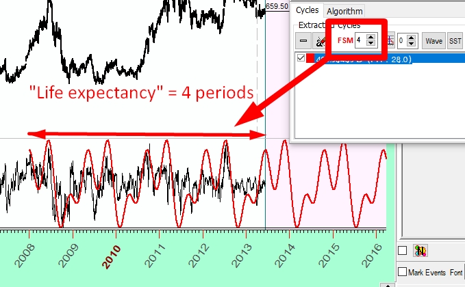
Let us look at FSM parameter closer. FSM stands for Forecast Stock Memory. It is the expected "life time" of some cycle. What does that mean? The cycle is there all the time, though in regards to the effect of this cycle on the stock market one and the same cycle may appear active/"live" or not relevant, at different periods of time. The cycle's "life expectancy" is the time span where this cycle appears being active. That is why we can use this cycle to forecast future stock market moves. We introduce this parameter as a result of the research conducted by Timing Solution team.
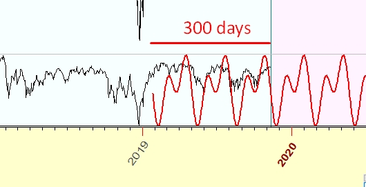
In the example below, FSM=3. It means that the cycle is present in the analysed data set (it is confirmed by the spectrogram), and we have observed this cycle working within the time span in the most recent data that equals at least to the last 3 cycles. Here, as an example, we have found 100-days cycle. We expect it be working for the last 300 days of price history:
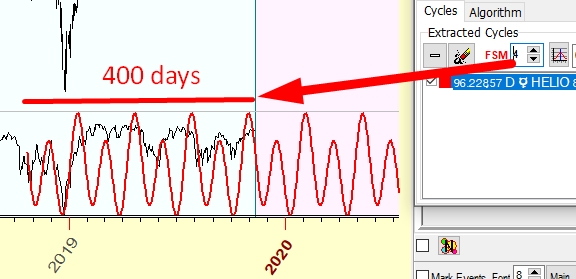
For FSM=4, it is the last 400 days:
Usually, for any stock market data set, cycles do not "live" forever; they appear being active for some restricted period of time. With FSM parameter, we can specify the "life expectancy" of the analyzed cycles. As it is mentioned earlier, do not set FSM too big. Based on our research, usually it is less than 7.
Picking up several cycles
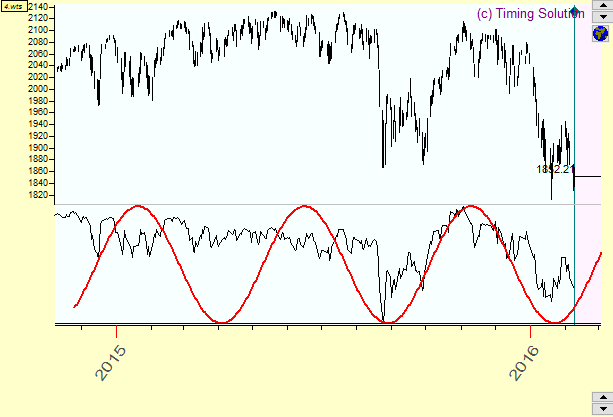
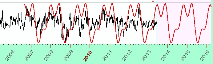
Till now, you have tried just one cycle, the top one on the spectrogram. Let us pick more cycles (166 and 263 days cycles above). All three cycles are shown now in the Main screen. They are color coded for your convenience. Here the 499-day cycle is shown in red, the 166-day cycle is shown in bluem while 264-day cycle is shown in green:
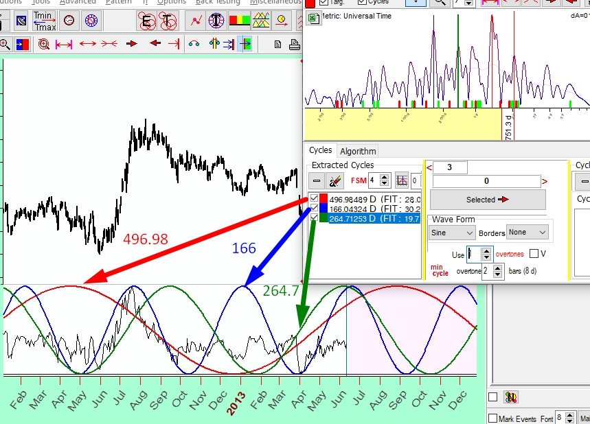
You can explore each one of these cycles separately and you can see how they work together.
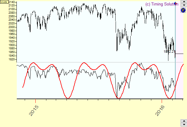
Superposition of several cycles
To see the mutual performance of these cycles in regards to the analysed data, create a superposition of these three cycles. It is very simple to do: drag and drop these cycles from the Spectrum window onto the Main screen. Or click the Wave button in the Spectrum window.
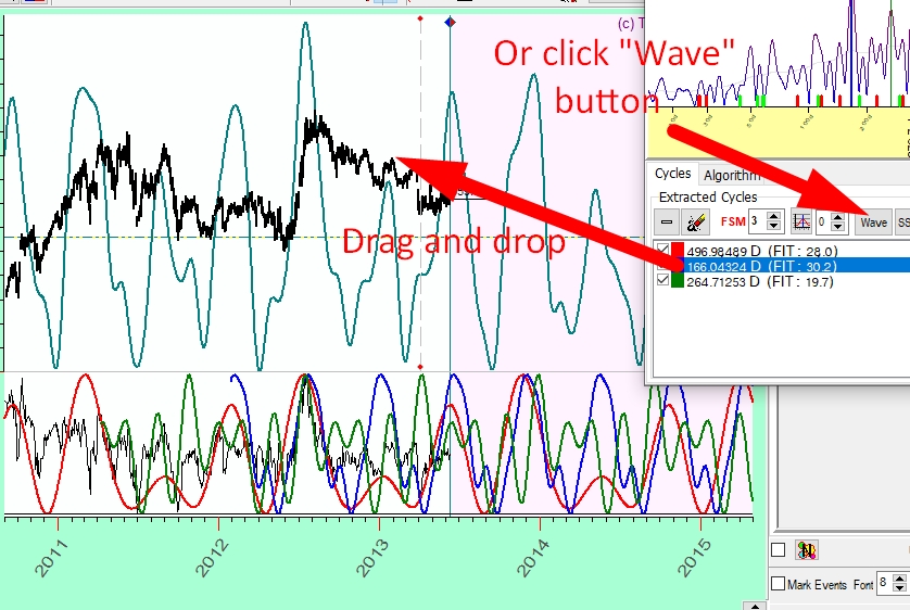
Now the superposition curve reflects the initial price chart better than any of those three cycles on their own. Prolonging these cycles superposition as far as you like to the future, you can have a nice projection line based on these three cycles.
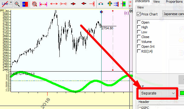
Customize the projection line
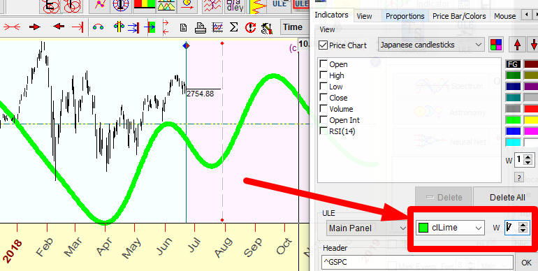
To your convenience while working with some projection line, you can customize it. You may change its color and the line's thickness through Main Window View.
In order to do that, you should make the RIGHT mouse click in the Main window and then, in the pop-up menu, choose "Main Window View" item or click this button:
To modify a color and thickness of the superposition projection line, please use these controls:
This option allows to display projection line in separate panel or overlay of price chart:
To delete this projection line from the Main Window, click this
 small button in
the right bottom corner:
small button in
the right bottom corner:
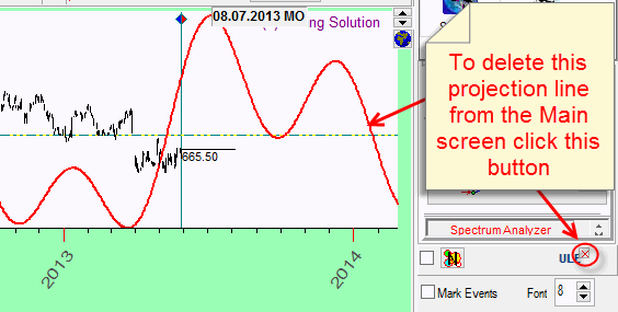
It can be done as well by making a RIGHT mouse click in the Main window and choosing "Delete ULE event" in the pop-up menu.
What cycle to choose?
You know now that combining several cycles may provide a better result than just one cycle. You can create a projection line based on as many cycles as you like. And you know also that too many cycles lead to getting a noise instead of a valid forecast. How to choose the best cycles?
There are two criteria and one recommendation for that:
- Choose the highest peaks on the periodogram;
- The width of a chosen peak should be as narrow as possible.
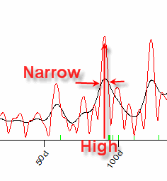
The higher the peak, the bigger the amplitude of this cycle. The narrower the cycle, the more energy is concentrated in this cycle.
Take a look at this example:
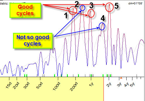
The peaks at this periodogram marked by red circles (1, 3, 5) are "good" cycles; i.e. these peaks are high and the width of these peaks is narrow. There are also other peaks; they are marked by blue circles (2 and 4), these cycles are not as good because these peaks are not as narrow. It means that the energy of these cycles is distributed in a wider range. It makes these cycles less precise.
Timing Solution team did a research for many different financial instruments trying different combinations of cycles. The recommendation is: do not use too many cycles, several cycles (1-5 cycles) are enough. You should remember that the models that use too many cycles are very good in explaining PAST price movements while they are not so good in FORECASTING future movements. Adding just one bad/unimportant cycle to your cyclical model may spoil the whole model. Be very picky while choosing your cycles.
Dominant cycles versus permanent cycles
The spectrum analysis is performed for fixed cycles. You may have seen as well the mention of "dominant" and "permanent" cycles. What are they? These are just terms. And sometimes the use of these terms in other software or in the literature is confusing. Let's discuss it a bit.
Permanent cycles are more obvious. According to their name, they are there all the time. Actually, it may be just another name for cycles in general.
In Timing Solution, the distinction between dominant and permanent cycles is in the way how to take their presence in data.
By default Timing Solution is oriented on search of dominant cycles, the cycles that have an important role for some time and then disappear. They disappear not in a sense of not existing any more. Instead, their effectiveness changes over time: for a while they would play a big role and then they would become less effective. Fixed cycles are always present, just like a sine curve that is unlimited on both sides, past and future. At any given moment, cycles accumulate or lose some portion of energy becoming more or less apparent. They do not work in the same manner all the time.
Multiframe technology is developed to catch these cycles. When the new portion of the price data is coming, the cyclical portrait of the financial instrument is changing as well due to the changes in the periodogram. Cycles used initially to create the forecast model may become not as important while other cycles ignored previously may start being important. It means that from time to time it is recommended to recalculate the spectrum by clicking "Recalculate" button.
To find permanent cycles (i.e. the cycles that always work the same way), set this parameter in Spectrum module:
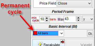
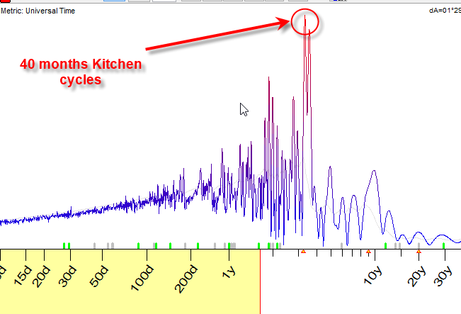
As an example, let us try to find a permanent cycle for DJII from 1885 to 2014.
This is the spectrum for Dow Jones; it shows the peak around the period of 40 months. It is a cycle well known to economists, so called Kitchen inventory cycle:
In most cases we work with dominant cycles. They are more typical for financial data, more tradable. Permanent cycles are mostly used for economical analysis, as these cycles are believed to work in the same manner now as they worked 10, 50, 100 etc. years ago.
Detrending, or what to forecast?
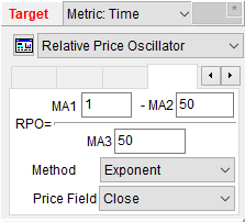
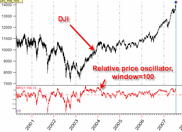
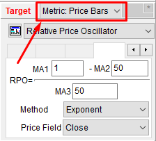
Most financial instruments have some trends. You have heard a saying: "Trend is a friend". It may be true at certain moments for a trader, but it is not true from the point of view of Cyclical Analysis theory. When scientists evaluate data sets, the first step is to get rid of a trend and anything that can distort a statistical picture. Therefore, it is mathematically necessary to modify price data before doing anything. We have to do that as our goal is to model the market behavior and make a forecast as close as possible to the functions used in forecasting, i.e. to sin curves. To reach this goal, we do not want the general trend of the stock to be used in the forecast, so we do not use the price itself to calculate the spectrum diagram. Instead, we use the detrending indicators. One of the most popular is the relative price oscillator (or percentage price oscillator). As an example, look at this indicator with the period=100 bars:
The parameters of this indicator are defined manually in relation to swings that the program tries to catch. Other indicators may serve as a forecast target as well: RSI, ADX, Volatility, etc.
In other words, the program performs the spectrum analysis not for original data (as it was done for Dow Jones Industrial index in the example above), with its up and down trends, but for one of its oscillators:
Oscillators are much more convenient for the cyclical analysis.
Intraday Data and Turbo Cycles
While working with intraday data, it is better to calculate the spectrum using price bar metric:
Also for intraday it is recommended to use Turbo cycles module. It extracts the most important cycles automatically and calculates the projection line based on these cycles. This projection line is updated in real time when the extra price history data is downloaded. You will find more info about this module here.
Working with Q-Spectrum module - going beyond "curve fitting"
Q-Spectrum module sets the new standard in financial analysis. In this module we have incorporated the methods of Walk Forward Analysis (WFA), a standard in finance, together with standard procedures of classical cyclical analysis.
Classical cyclical analysis (Fourier transform) is good when we try to describe the past assuming that the future simply repeats the past movements. This is true for many physical/natural phenomena ... but not for stock market and any other activity that involves humans. Classical cyclical analysis applied to the stock market brings "curve fitting" effect. It is a situation when some projection line perfectly describes the past but fails to forecast the future. Q-Spectrum module allows to select only those cycles that are suitable for forecasting and, accordinly, suitable for trading.
This is how the periodgram for corn futures calculated with Q-Spectrum looks:
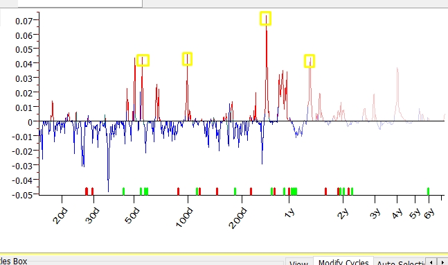
As with the classical spectrum, the highest peaks here correspond to the most important cycles. Exactly in the same manner, as we did for classical spectrum, we can pick up these cycles. When picking up a cycle in Q-Spectrum module, it is recommended to pay attention to the cycles that are confirmed by cycles with multiple periods. As an example, 100-days cycle should be confirmed by the presence in the same periodogram of the cycles with periods of 200, 300, 400 etc. days. We still do not quite understand the nature of this phenomena, so we take it as phenomenological fact.
Here is a practical example:
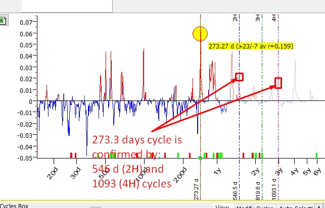
Q-Spectrum reveals here 273.3-days cycle; it is confirmed by the presence of the cycle with doubled period of 546.6 (2 x 273.3) days cycle though it is just a small peak on periodogram. This cycle is also confirmed by the presence of 1093-days cycle (4 x 273.3). Thus, 273.3-days cycle (seen as the most important on the periodogram) is confirmed by two larger cycles.
Another cycle that we can pick up the same way is 478.8-days cycle.
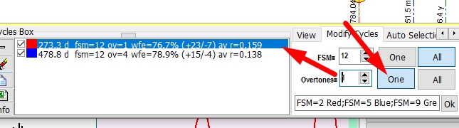
In the Main screen you can see the superposition projection line based on these selected cycles. You can modify FSM and the amount of overtones in the "Modify Cycles" tab:
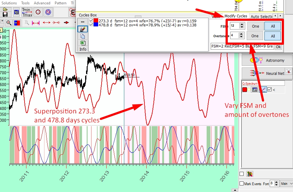
You can change FSM and the amount of overtones for each cycle separately when "One" button is pressed. In this case, the program makes a change to the highlighted cycle only:
Here is video recording that shows how to build Q-Spectrum projection line for the same financial instrument, Corn futures (data till the mid of 2013). This class is updated in December 2019, so we can compare how this forecast works:
Advanced forecasting techniques
Timing Solution software has more features that apply different methods of Cyclical Analysis. Below is a short description of those features.
Wavelet Module: this module allows to see the cyclical phenomena in dynamic environment, i.e. you can see how the cycles appear-live-and disappear. More information about this module is contained here.
Committee: the same cycle/cycles can generate several versions of projection lines, this module allows to see all these projection lines together. Documentation for it can be found here.
Q-Spectrum module: this is a unique module that applies methods of Walk Forward Analysis (the standard financial analysis technology) to financial data. Its description is here.
Visual cyclical analysis
Behind very complicated math methods used in Timing Solution software (like Spectrum or Wavelet or some other method) lies a very simple and clear idea. We try to find the track of regular waves in financial data. All mentioned mathematical powerful tools are designed for this simple task of catching a regular wave in financial data as early as possible. Very often the simplest visual analysis of the price chart helps to reveal these cyclical patterns. Specially developed Timing Solution charting tools are very helpful for this task.
That is why we recommend, before working with some sophisticated tools, to apply a simplest visual cyclical analysis. It is just looking at your price chart attentively and identifying some regular patterns there.
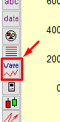
The charting tools in the "Wave" section help you to do that:
Let's try these charting tools:
Harmonic Wave
Suppose that you see a two-wave regular pattern in your price chart, like this:
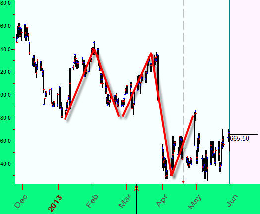
To model it, we build a sine wave overlay of price chart using "Harmonic wave" charting tool:
Adjust the overtones, try and calculate half-length of the wave, one third of it, and so on. Sometimes (as shown on the picture below) they work:
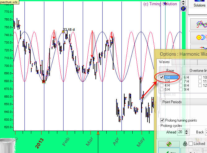
For your convenience it is recommended to disable snapping mode by pushing this button (otherwise the program automatically catches the nearest highs/lows):
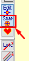
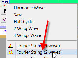
Fourier String (1 wave)
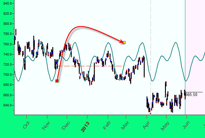
Take a look at A-B wave between mid of 2010 and end of 2011:
We can model this A-B wave using Fourier analysis and prolong it into the future. Choose "Fourier String (1 wave)" charting tool; drag the mouse cursor from the beginning of this wave (point A) to its end (point B). You will see this wave prolonged into the future.
This is another example. Here there are two waves in the price chart between the beginning of November 2013 and the beginning of March 2014.
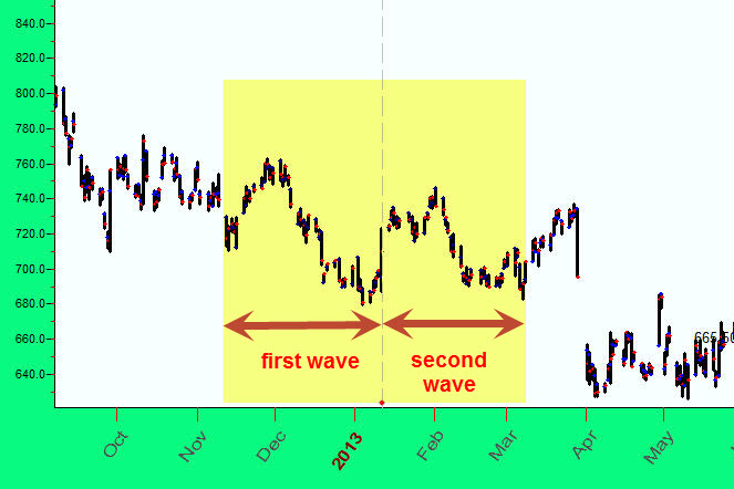
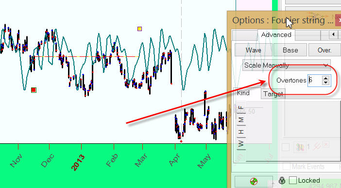
To model and prolong this two-wave pattern into the future, apply "Fourier String (2 waves)" charting tool:
and drag the mouse cursor to cover two-wave pattern:
It is recommended to experiment with the amount of overtones parameter to enrich/simplify the projection line:
These are just some charting tools based on classical Cyclical Analysis methods. The software has more charting tools, and they are discussed here.
This concludes the tutorial about the basic cyclical analysis and the use of Spectrum Module. Next lesson covers Astronomy Module.
Additional study regarding Spectrum and Cyclical analysis
Very basics of harmonic analysis - a detailed explanation of basic definitions and methods used in harmonic analysis (periodical functions, waveforms, Fourier analysis, overtones ...)
Cyclical analysis in essence in 33 pictures - a general explanation of different cyclical models that are present now in Timing Solution software (classical cyclical analysis, wavelet analysis, astro cycles, analysis of price patterns).
Wavelet analysis: Wavelet analysis is a part of cyclical analysis especially important for financial data where practically any cycle does not represent itself forever; cycles have some restricted "living" time. Wavelet analysis issues are discussed in these articles below:
Wavelet analysis - cycles early warning system - a basic explanation regarding wavelet analysis
Wavelet Cycle Hunter - thoughts on application of wavelet analysis for financial data
Fading cycles of the stock market - the techniques of classical cyclical analysis applied in physics not always may be applied for financial data. In this article you will find the explanation why...
Q-Spectrum: Q-Spectrum is a new powerful module that allows to reveal cycles using a unique combination of methods of classical cyclical analysis and classical financial analysis (walk forward analysis). These articles illustrate the idea:
Q-Spectrum - an explanation of Q-spectrum features
Anti-Information - a discussion of new issues that Q-spectrum brings to our attention
Turbo cycles: This module automatically calculates spectrum, extracts the most important cycles and calculates the projection line based on these cycles. This is a quick way to do cycles analysis which is especially important for intraday chart; the module perfectly works in real time mode. These articles are recommended:
Turbo Cycles module - a detailed explanation how Turbo cycles module works
Back Testing for Turbo Cycles module - a description of ways to find optimal parameters for Turbo cycles models